Wikipedia gets its first makeover in over a decade
The world's largest online encyclopedia looks a tiny bit different
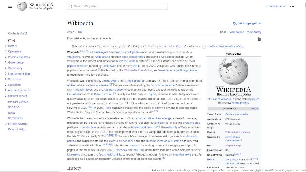
The Wikimedia Foundation has rolled out the first big redesign to the desktop interface of Wikipedia in 12 years, and while it’s not exactly a mind-blowing do-over, some subtle changes have been made to the hugely popular online encyclopedia.
Perhaps the most obvious change is the site’s shorter line width. Wikipedia articles now appear at a maximum width that better centers their content on the screen, which will hopefully make for a more comfortable reading experience and better retention of content. The default font size has also been increased to make reading long paragraphs more comfortable.
➡️ The Shortcut Skinny: Wikipedia redesign
😲 Wikipedia has been given its first redesign in over a decade
🧹 The Wikimedia Foundation has cleaned up the look of the online encyclopedia
🌟 Changes have been made to the search bar, line width and table of contents
🔎 It’s all supposed to make the site easier and more comfortable to read
The table of contents section has also been shifted to the left-hand side of all articles. It remains visible as you scroll down the page, letting you navigate around the various sections of an article without having to scroll back to the top each time you want to jump to a subheading. It can also be hidden if you’d rather blank white columns flank the article.
Similarly, the site’s left-hand sidebar is now collapsable, and the internal search bar has been improved to show little images and descriptions to make it easier to find the entry you’re looking for.
A few other visual changes have also been made. The Wikipedia logo in the top-left corner has shrunk in size, and the language selection option has been moved to a more prominent position in the top right, making it easier for multilingual readers to swap languages without too much digging around.
Wikimedia Foundation has been talking about the makeover, officially called Vector 2022, for the past few years, and in a blog post says it hopes the “series of improvements to Wikipedia’s desktop interface will make the site easier to use and more welcoming for readers and contributors alike”.
The Vector 2022 layout will also roll out to other Wikimedia wikis – such as Wiktionary and Wikibooks – although if you really don’t like the new look, you can disable it and revert back to the old Vector Legacy interface. To do that, you’ll have to create an account and follow these brief instructions.
Wikipedia remains the largest online encyclopedia, containing over 58 million articles viewed 16 billion times every month.


