
Motorola Razr+ unboxing and first impressions after 5 days: thrilling and delighting
I loved the Motorola Razr+ when I had a sneak preview two weeks ago, and after five days with it as my main phone, it's still thrilling and delighting me in fun, quirky ways!
The Motorola Razr+ is not your average smartphone. Aside from the average unboxing experience, there’s nothing about this phone that screams “just another foldable phone”. Instead, it screams unique, different, and fun, and using it at my best friend’s wedding over the weekend, it captured the attention of just about everyone.
When I first saw the Motorola Razr+ two weeks ago, I fell in love. In my brief hands-on time, the front display left me enamored and eager to spend a lot more time. After almost a week with the Razr+, I’m more in love than when I started, and it’s delivering the flip experience we’ve all been waiting for.
It’s too soon to give you my full thoughts – those will come in our detailed Moto Razr+ review next week – but consider this to be part one: the honeymoon period.
What’s in the Motorola Razr+ box?
We received a reviewer’s care package from Motorola that featured a subtle chin design reminiscent of the original Razr, and the recent remakes.
Inside was the retail Motorola Razr+ box, and a 30W TurboPower charger. When you buy one, you won’t get a charger in the box, with Motorola continuing the eco-friendly trend of virtually every manufacturer right now.
Inside the retail box, you’ll find:
Motorola Razr+ in your color of choice
A USB-C to C cable
A SIM card removal pin
Documents about warranty
It’s simple, the box is small and I really miss the special unboxing experience of the first Motorola Razr. That box provided an experience, and in challenging Samsung, Motorola has opted to just do the same as the Korean manufacturer.
Considering the lifestyle approach of the new Motorola Razr+ 2023, a better unboxing experience would have worked wonders to capture attention on social. Thankfully, the phone does the job itself extremely well, so you won’t be disappointed.
Motorola Razr+ stands out, just as intended
When I first used the original Galaxy Z Flip in public, I was stopped by a lot of people asking questions including “What phone is that?” and “Is that the new Samsung?”. It was refreshingly unique and different, and it stood out in public. At my best friend’s wedding last weekend, the Motorola Razr+ achieved the exact same thing four years later.
In building a flip phone with the biggest screen yet, Motorola had to rethink the experience. Small widgets, limited functionality and the front display being an afterthought were all traits that Motorola had to evaluate and revolutionize.
At the same time, it feels like some of the Moto features we know and love - specifically the flick of the wrist gesture to launch the camera, and the smiley faces when taking a camera - feel so at home, it's as if Motorola designed them years ago with this form factor in mind.
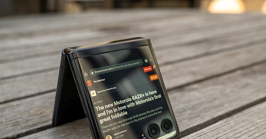
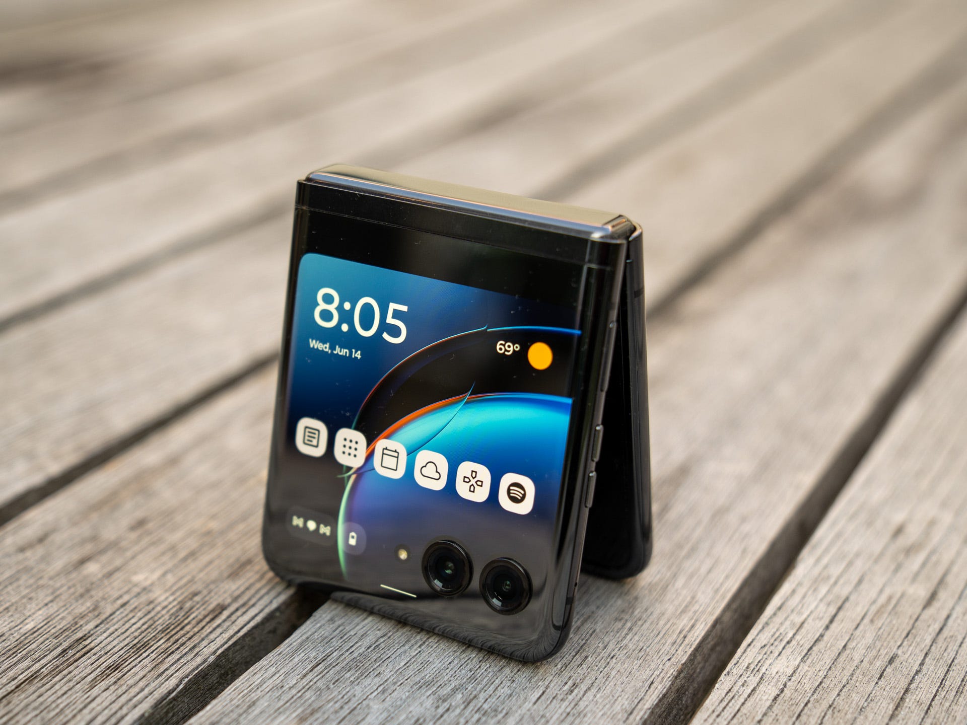
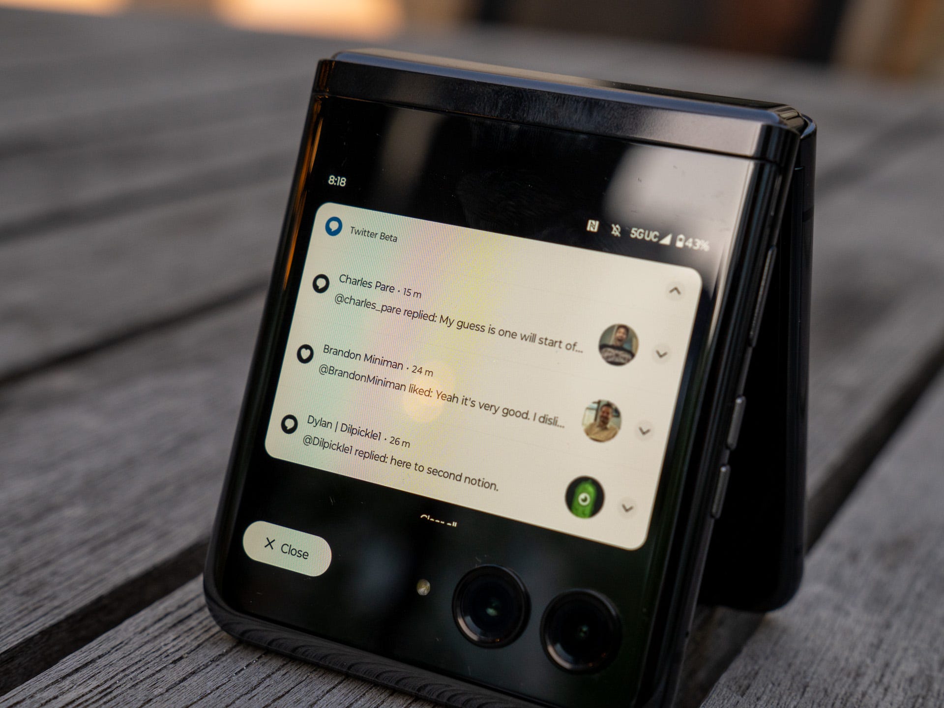
The magic of the Razr+ comes from the fact that the front display and main display act in unison; rather than the Cover Display feeling like an afterthought, Motorola has developed a very cohesive experience. A large part of this is that any app can run on the front display, which opens up a world of possibilities unrivaled by any other device.

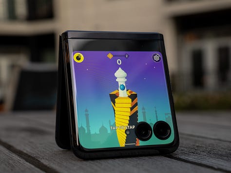
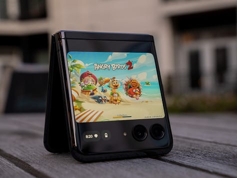
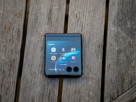
Take, for example, gaming on the Cover Display: there are a few preloaded games that provide endless amounts of fun and then you can download any game or app from the Play Store and run it on the front display. Some of these are not very good at all, but Angry Birds is actually a great one-handed small phone experience. Pokemon Go is another that could be a lot of fun if you're into it (sadly, I'm not)! This also lends a further wow factor that catches the attention.
A great small phone experience
It's surprising just how good the front display experience is. I fully expected to find it lacking but it really delivers in all the ways it matters. In many ways, it's reminiscent of devices like the Blackberry Passport, if they had had the same size screens but relied solely on the on-screen keyboard.
The keyboard is the part that really surprised me. I thought it would effectively end up as a niche feature I rarely used, and instead, I use it for about 40% of all my inputs across both displays. Even after scaling the display and font sizes down to pack more into the display, the keyboard is limited to a single input row which limits it somewhat. That said, I've been able to easily write 100+ word messages and replies, just with a few extra taps to hide the keyboard to review the entire message I'm sending. It's not the perfect experience, but it's really close and I use the front display to reply to most of my notifications and messages.
I'm sure some of you are wondering: can you use any keyboard on the Cover Display? The answer is no sadly, which means adopting Gboard for all your input needs. For a lot of people, this won't be an issue but I'm a decade-long Swiftkey user and the lack of support on the Cover Display meant I've had to switch entirely to Gboard. The learning curve has been interesting: Gboard itself works really well, is fluid, and has a great one-handed mode built in.
At the same time, it doesn't have my Swiftkey history, my fingers are struggling with the fact Gboard is slightly slower when swiping the period key for other characters, and I find a lot of the number and symbol layouts to be confusing. This is very much my problem, but even if you're a Gboard user, it's worth keeping in mind that if you do resize the keyboard at all, it also affects the Cover Display rendering it next to useless if you like a larger-than-default keyboard size. On my particular Gboard install, I can only resize when it's floating rendering the above entirely moot.
I also use it to do a lot of scrolling, and this is where it also shines thanks to the 144Hz display. The lifestyle focus of the Razr+ means things like gaming are a key focus area and the high refresh rate - which is higher than most phones and both displays on the Galaxy Z Fold range - takes this from average to spectacular. For apps with feeds like Twitter and Instagram, I find it a really easy way to browse, reply and interact and much prefer it to a traditional-sized phone because I can do it one-handed while walking and have far fewer concerns about dropping the phone.
The ergonomic design is what made phones like the iPhone 13 Mini and old Sony Compact range great little phones, and the Motorola Razr+ does really well to give you the small phone experience with the ability to have a full-size display when you want it.
Fun, quirky cameras that you may or may not like
I've talked to a few friends who are also reviewing the Razr+, and this seems to be the part that divides us; some people are fine with it, but others find it severely lacking and unacceptable, given the price. However, after using it to take a lot of pictures (mostly selfies) at my best friend's wedding, I realized that it isn't perfect at all, but it doesn't need to be. It does a more than good enough job for my needs, and I would absolutely use it at another wedding.
I love taking selfies with it because the front display acts as a viewfinder while you're using the main cameras. Some folks may be tempted to look at it through the lens of an iPhone or Galaxy S23 Ultra, but I think that's not an unfair comparison given the camera isn't the primary focus of the Razr+; that is the Cover Display, which Motorola has nailed the experience for.



In most lighting conditions during the wedding, I loved shooting with the Razr+ camera. Yes, I could have taken better photos when not using it in selfie mode, but one of my primary goals was to take photos with my friends, and given the state of front-facing cameras on most Android phones - the Pixel range being an obvious outlier here - I would prefer the photos taken by the main sensors on the RAZR+. This is because even though they're not the best, those two cameras are better than most selfie cameras you would otherwise be using on another phone.


There are a few areas where the cameras don't quite cut it. It's super tempting to switch to the ultra-wide camera when taking group shots, but the lack of OIS and wide field of view means some shots will come out blurry, and I often end up with a bit of my palm in the corner of the photo. That said, it can still take great photos when you don't have either of those.
When you're not shooting with the ultra-wide, it takes great all round photos. It does struggle in some low light conditions, and some shots do still come out blurry - although that's also quite likely because I was fairly drunk when taking these photos, given it was a wedding! - but for the most part, I'm very happy with the photos that come out of it. The actual selfie camera? I've really not found a need or desire to use that yet, but I'll test it before the full review is up!


When you're shooting in low light using the Cover Display and the main cameras for selfies, the center of the screen becomes a circular viewfinder, and the rest of the display goes bright white to increase the available light. I love how Motorola has implemented this, as not only does it improve the quality of the photos, but it also makes it easy to see the framing and overall photo quality before you hit capture. For a lot of phones, you have to hit capture to then trigger the screen, becoming a flash and/or the software algorithms kicking in to make the best photo, and this then means taking multiple shots until you're happy. With the Razr+, I found that my group was happier with the first or second attempt compared to the iPhones and Galaxies otherwise being used.
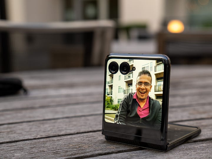
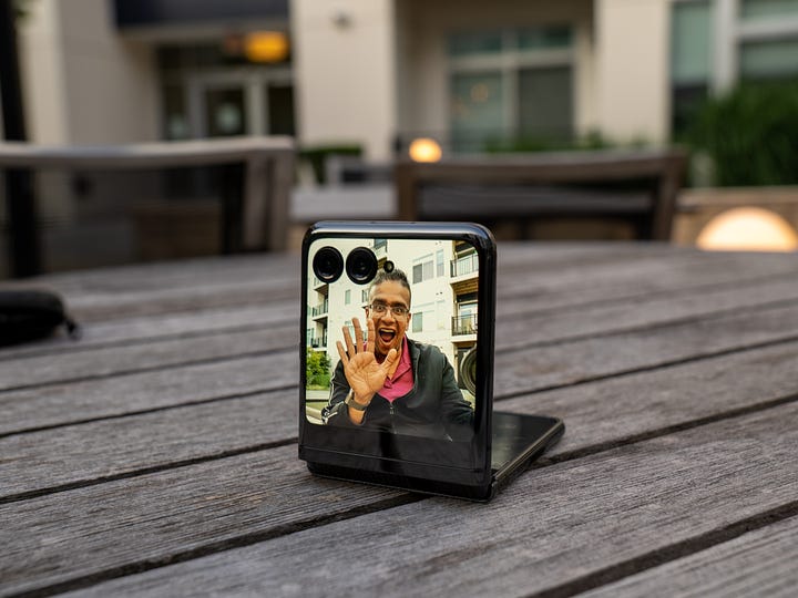
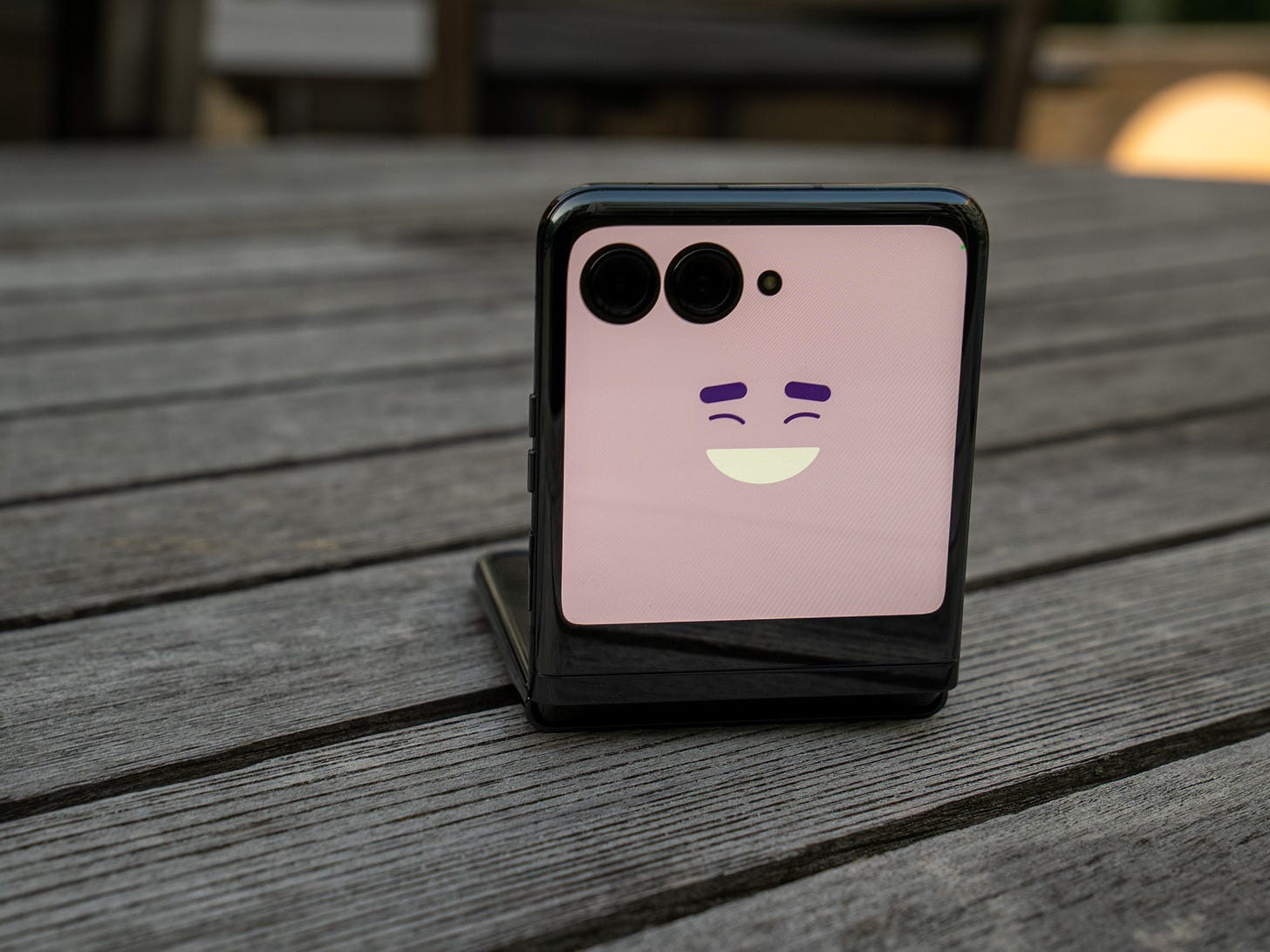
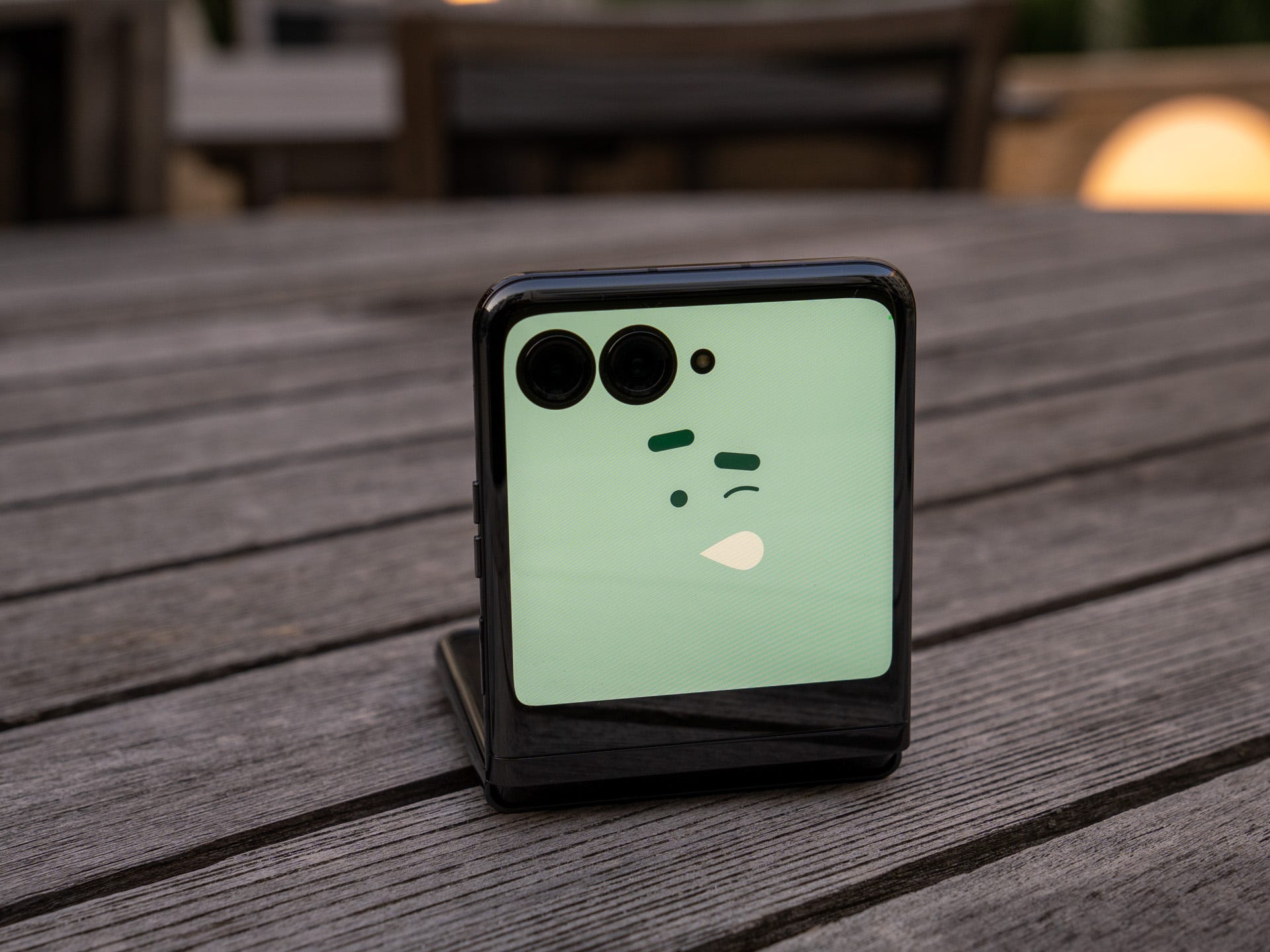
Like the Razr+ that came before, the Razr+ has a fun little feature that lets you use the Cover Display as a secondary viewfinder when you're taking a photo of someone else. First, they see this very cool emoji-like animation - which caught the attention of a lot of people when I was taking pictures at the wedding, and people naturally found themselves drawn towards the camera and the photo - and then let the subject see the photo as you're taking it.
Motorola Razr+ design and durability
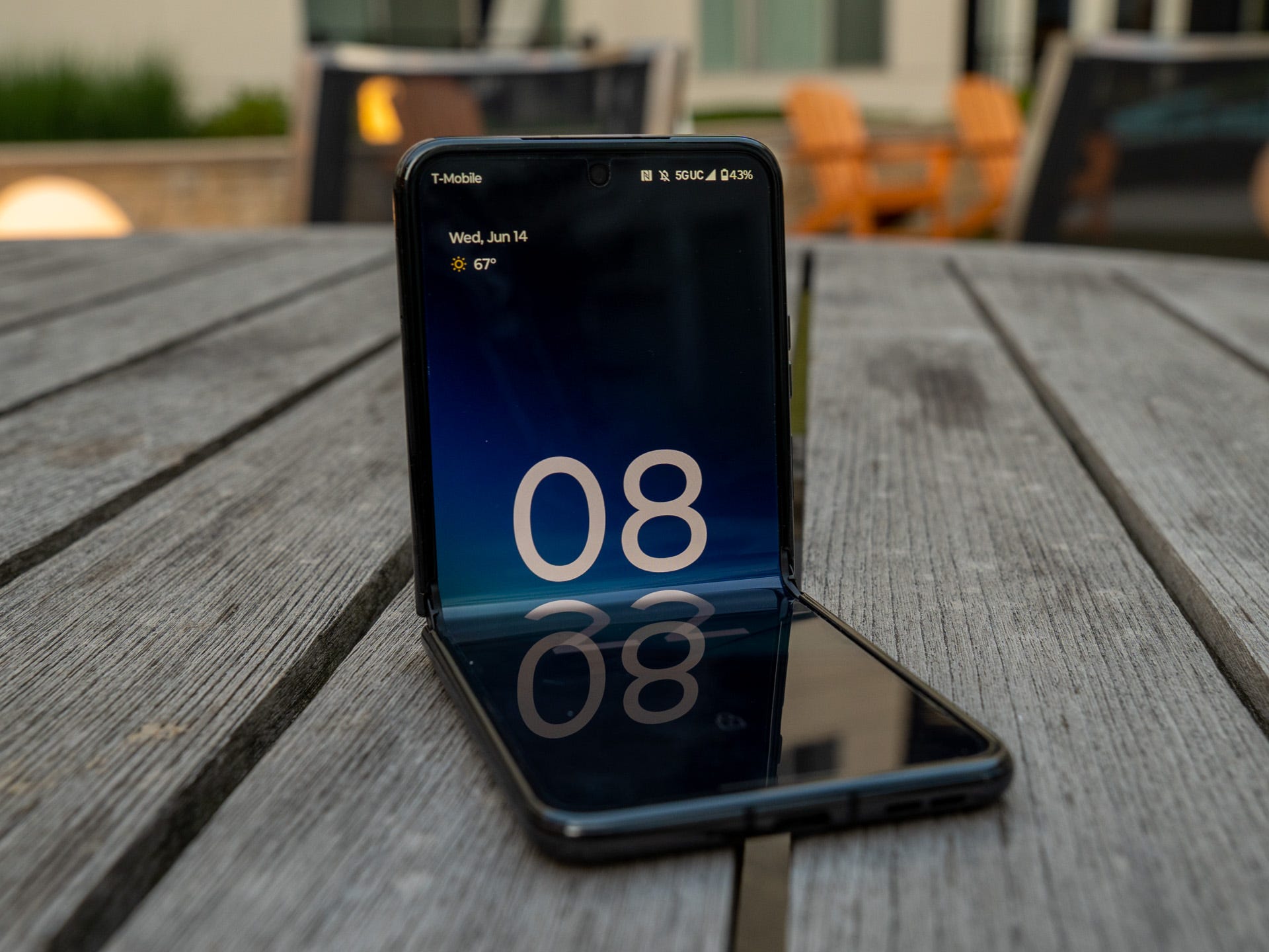
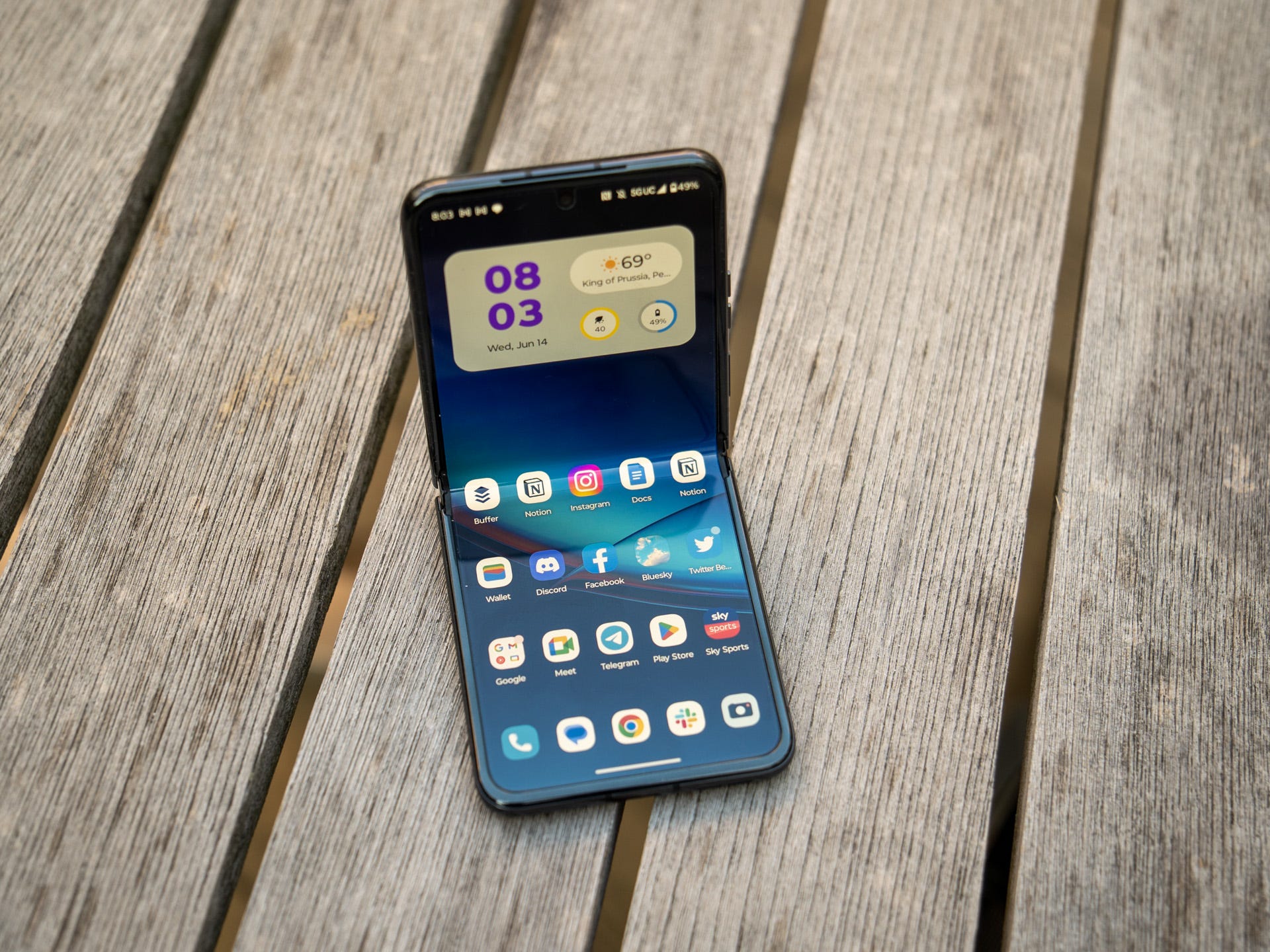
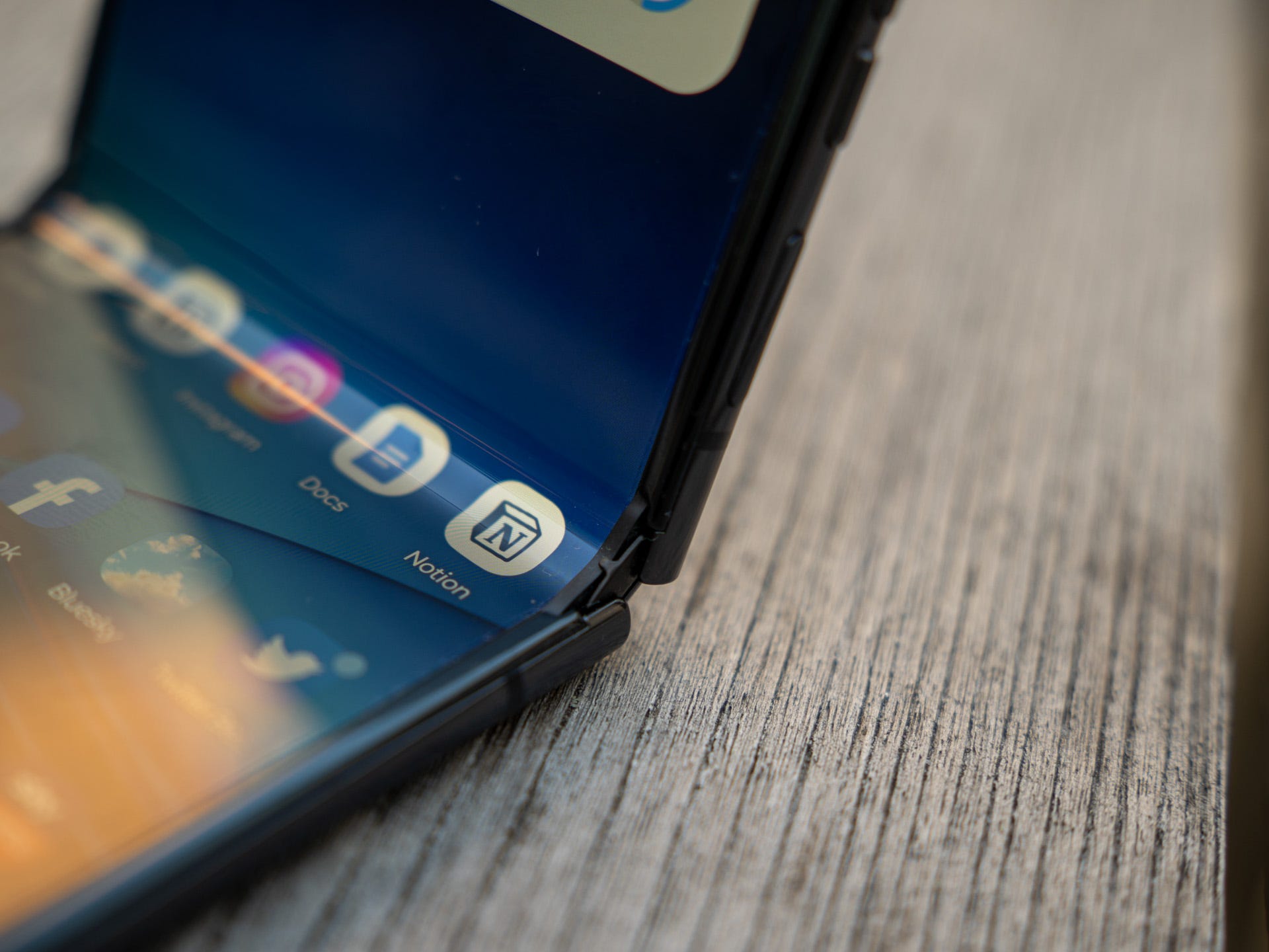
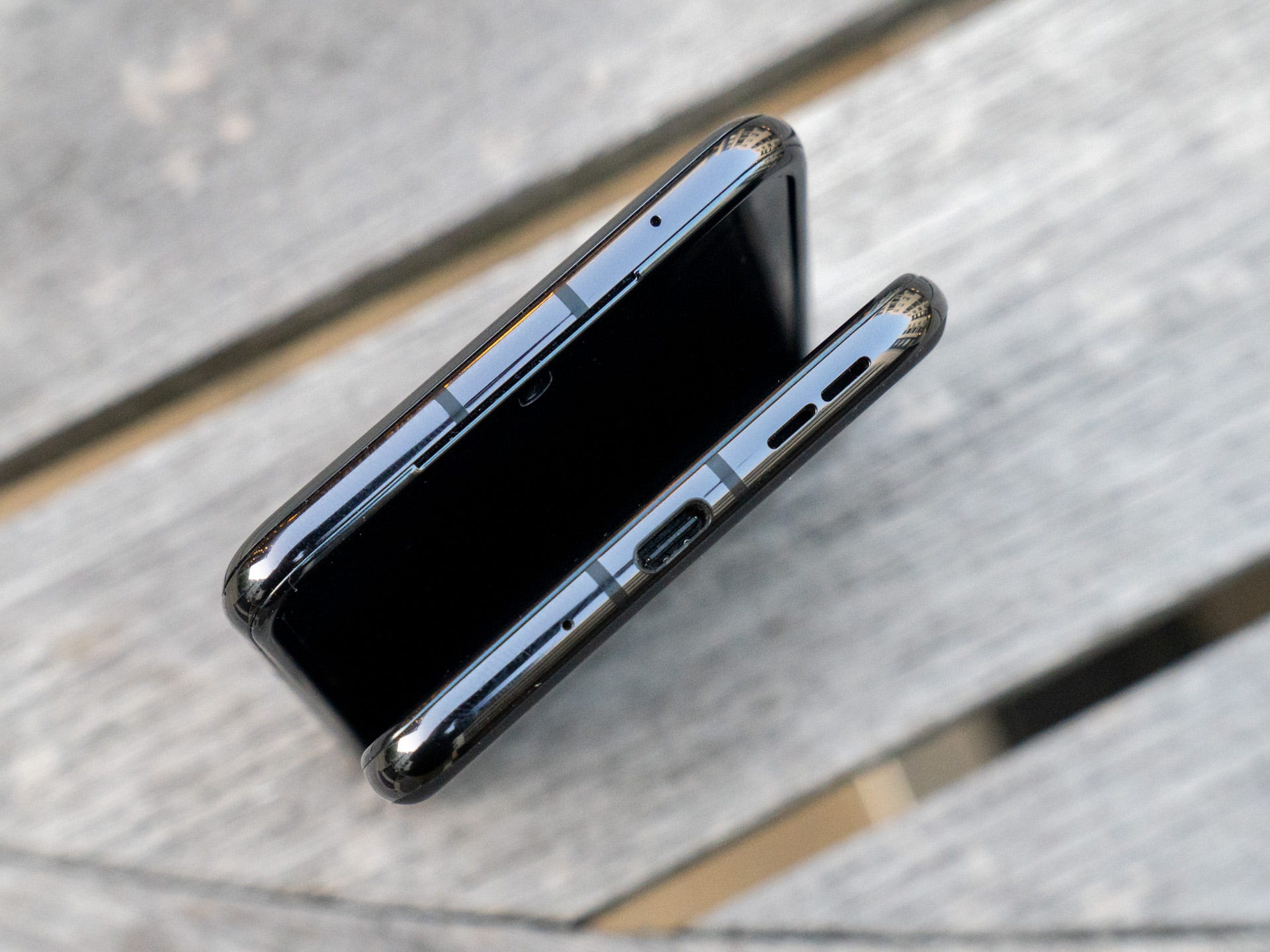
First, the design. Like I covered in our install hands-on, this is very much a Razr and I love the design. The teardrop hinge means it folds closed fully without a gap, can stay open at any angle, and has a crease that you quickly forget even exists. The black version I have - and the Glacier Blue model - have a frosted glass back with a matte finish that provides some grip, but doesn't fully alleviate my fears of dropping it. The Viva Magenta model - which is exclusive to Motorola.com and T-Mobile in the US - uses a vegan leather finish that provides much more grip.
The main display is a joy to use as well. The 6.9-inch FHD+ pOLED panel is vibrant, rich, and immersive. The 165Hz dynamic refresh rate makes gaming, scrolling, and all-around usage a real joy. I've used every Galaxy Flip that Samsung has launched, and the Razr+ display is just as good as any of those screens.
The overall hardware package is also impressive enough to get the job done. The Snapdragon 8+ Gen 1 processor isn't as efficient or powerful as the rumored 8 Gen 2 in the upcoming Galaxy Z Flip 5 but works wonderfully in the Razr+. The model that Motorola sent me has 8GB of RAM and 256GB of storage and aside from one glitchy moment - until I restarted the phone - has yet to fail in any task.
Most people are concerned about the durability of foldable phones and the Razr+ takes a small step to addressing this. The Razr+ has IP52 certification, meaning that it is protected from limited dust ingress and water spray less than 15 degrees from vertical. In comparison, the Galaxy Z Flip 4 has IPX8 meaning it can survive in up to 1.5 meters of freshwater for up to 30 minutes.
The Razr+ is the first foldable to offer any protection against dust ingress, but the water rating does concern me: when I got back to Pennsylvania from the west coast wedding on Monday morning, the weather was beautiful. Less than 12 hours later, it was like being in a monsoon with a torrential downpour, and I found myself uncomfortable exposing the Razr+ to those conditions in any way.
Motorola Razr+ battery and charging
Under the hood, it's powered by a 3,800mAh battery and this is one of my concerns so far. It's not a major concern at all; the Razr+ offers stellar all-day battery life and has pretty much seen out the day for most of my usage. I suspect that that is because I've adopted the Cover Display in a big way and I suspect that your battery life will vary significantly depending on which display you use more.
My concern has been around the network performance, which also harms the battery life. In every single day of usage so far, the mobile network has been the biggest battery drain, usually consuming 20-25% of the battery by the end of the day. While I've had no trouble in calls, I have noticed that the Razr+ drops down to Edge in spots like my elevator where every other phone I've used remains locked on 5G.
The overall network stability also seems weaker on the Razr+, with me noticing that it frequently drops to no service when driving down the freeway where, again, no other phones seem to struggle. I've reached out to Motorola about this and will continue to monitor it before the full review so I'm reserving judgment until I see the longer-term effects, but talking to other reviewers, it doesn't seem to be limited to just my review sample, and it doesn't seem to matter whether you use a physical SIM or the eSIM slot.
That said, when the battery does get low, 30W charging tops it up to full in about an hour, and it crosses 50% in about 15-20 minutes. There's also 5W wireless charging which is great to see come to Motorola's foldable range for the first time.
I fell in love with the Razr+ and this feeling is getting stronger
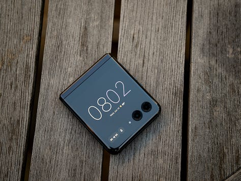
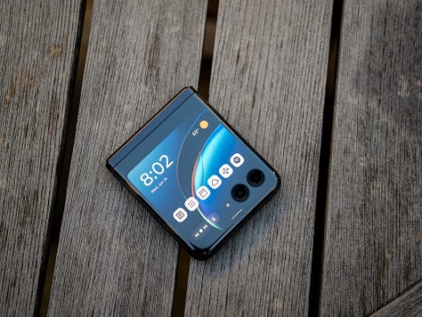

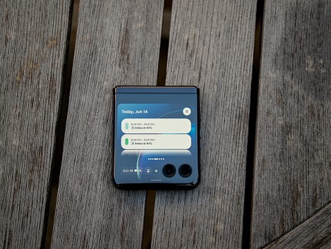
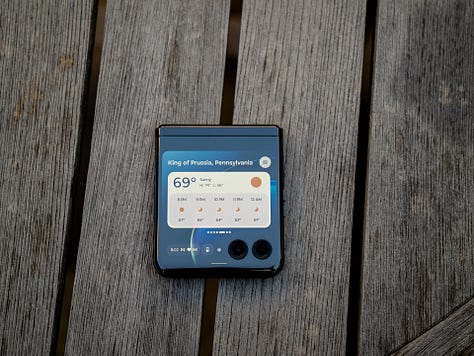
With every phone I review, there's a honeymoon period and then I lose interest. The few recent exceptions have been Samsung's foldable range and the Ultra variant of the Galaxy. The Motorola Razr+ joins this rather special club for me, because of just how good the overall experience has been so far.
It's taken Motorola a few years to get it right but so far, the Razr+ feels like the right evolution of the Razr franchise and what the original Razr remake should have been. Most importantly though, it's the first time in many many years that Motorola is a credible threat to Samsung, and I'm now very excited to see how Samsung innovates in the face of some very good competition.
Despite some flaws that will be deal breakers for some, and could yet consign the Razr+ to my phone drawer, I am more enamored with the Razr+ after five days than I was when I started. After writing all of this on the main display of the Razr+ - aside from about 200 words on the Cover Display itself - I think it's because it's the best iteration of a flip phone I've used yet. Of course, you'll need to wait for the full review to see whether this is my final verdict so stay tuned for that next week!








Why not the latest processor