Motorola Razr+ review: the best flip phone ever made
I loved the Motorola Razr+ at first, and I still love it two weeks later. The Cover Display is a game-changing experience that makes the Motorola Razr+ the best flip phone ever made.
The Motorola Razr+ is not your average smartphone. It’s designed to stand out, and stand out it does in so many ways. From the excellent Cover Display to the stylish design, unique form factor, and the little things, there are a lot of reasons I love the Motorola Razr+.
The largest front screen on a foldable brings new experiences to foldable phones and Motorola’s unique software tricks help create a stunning experience, and I just can’t put this phone down.
When I first saw the Razr+ several weeks ago, I fell in love. That was the same as the first Razr back in 2019, which failed to live up to its expectations. Fast forward a few years, and Motorola has learned its lesson: the result is the best flip phone ever made.
If you’re on the fence about the Motorola Razr+, look no further: I highly recommend it, and you won’t be disappointed. It costs $999, but AT&T has an awesome Motorola Razr+ deal that will give it to you for $5 per month with no trade-in required.
Motorola sent over a Razr+ in Black for review. We spent just under two weeks with the device, and Motorola had no input into this review.
Review score: 4/5
🏆 Editor’s Choice Award
Pros
✅ 📸 Fantastic selfies with the main cameras
✅ 📺 Stunning Cover Display
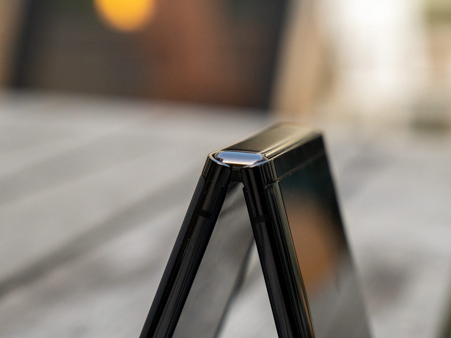
✅ 🪛 Teardrop Hinge = almost crease-less screen
✅ 📏 Thin and light design
✅ 📙 No gap when closed
✅ 👓 Clean, well-optimized software
✅ 👋 Motorola has some cool gestures
✅ 🌈 The Viva Magenta color is absolutely gorgeous
Cons
❌ 🪫 Battery life could be better
❌ 📷 Cameras can be inconsistent
❌ 💪 Lacks strong protection
❌ 📀 Software isn’t supported for as long as other phones
Motorola Razr+ video review and unboxing
In addition to the full written review below, we also did a Motorola Razr+ unboxing and first impressions.
Our full video review will be up shortly and we’ll add it below once it’s live!
The Shortcut’s skinny review (5 min read)
I’ve used a lot of different flip phones over the past two years, and each company takes its own approach. Samsung made this form factor the mainstream for most customers, and so far, it hasn’t adopted a full-screen on the outside, although this is expected to change next month with the launch of the Galaxy Z Flip 5.
The Oppo Find N2 Flip increases the size of the screen on the phone but opted for a vertical display which has some value but does impact its overall usability. Meanwhile, the Vivo X Flip adopts a horizontal front screen but is smaller and less usable.
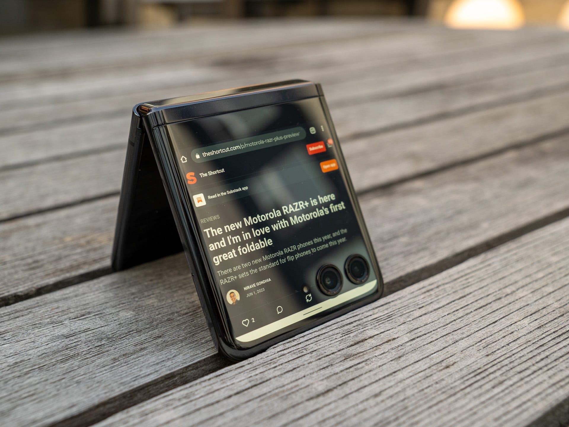
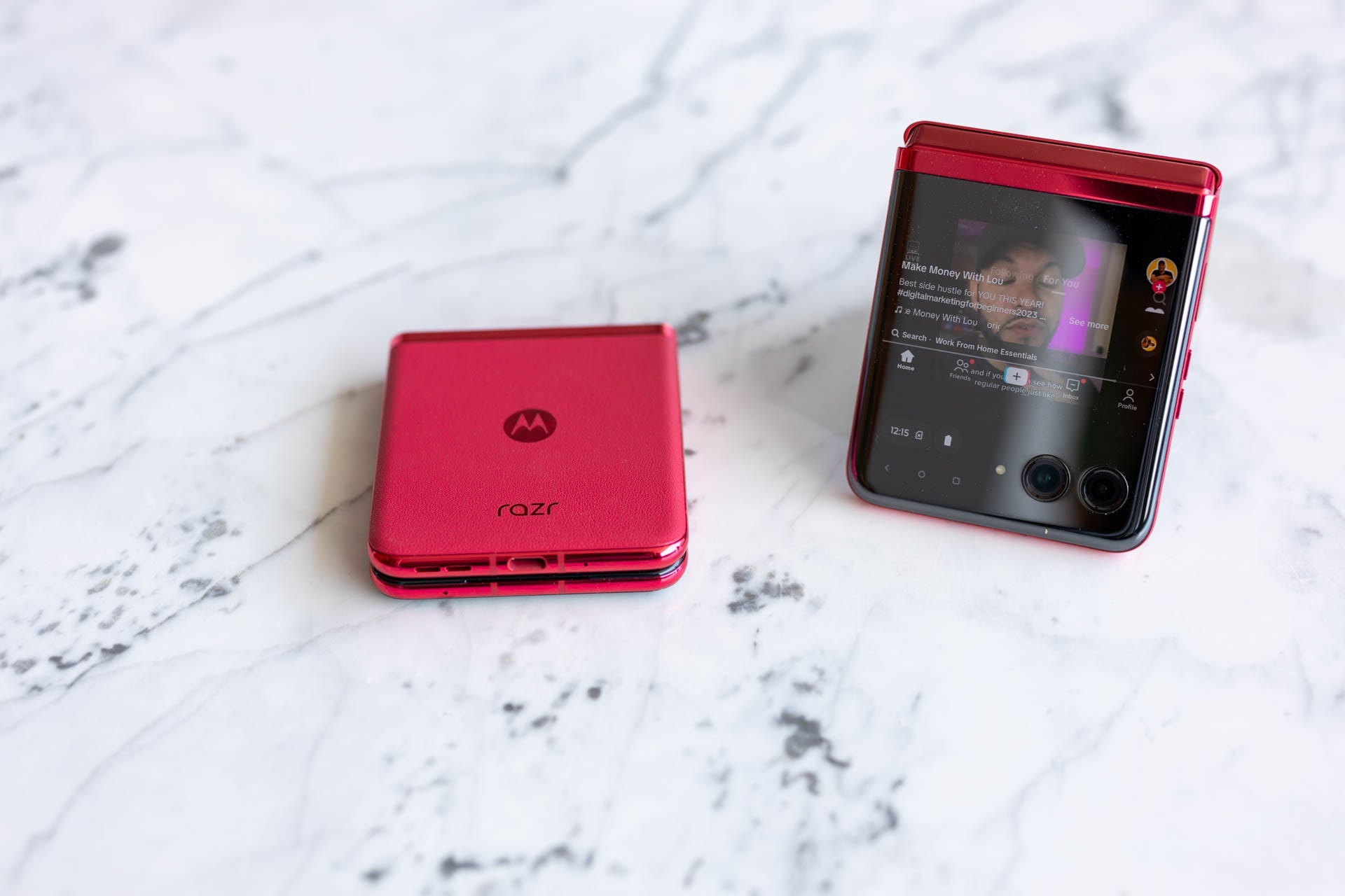
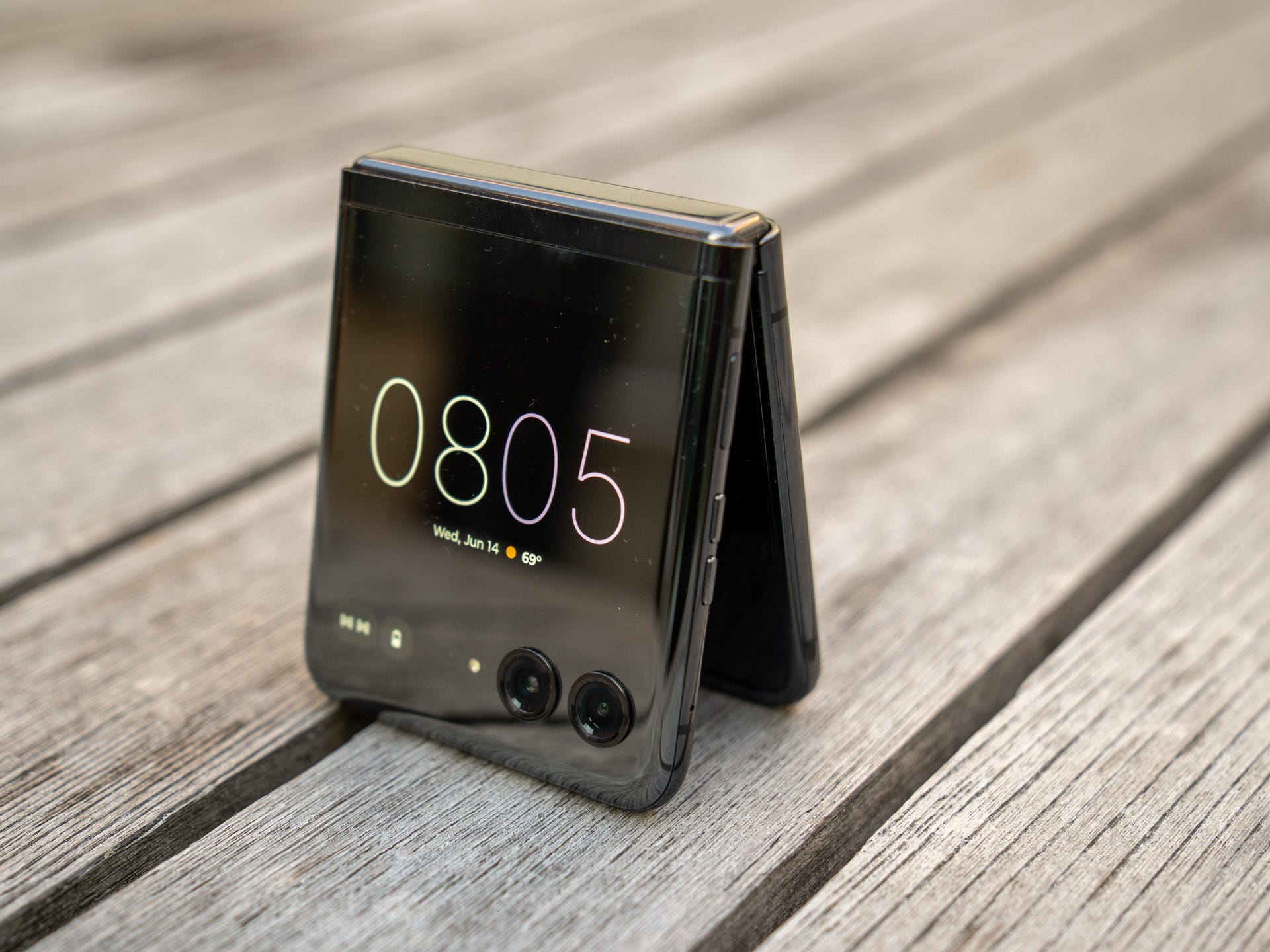
The Motorola Razr+ has my favorite design so far. The large display on the front acts like a second phone, while the teardrop hinge means the crease on the inside is barely noticeable. Some nifty tricks allow you to tweak the front experience between displaying apps in an overflow where the cameras can block access to certain menus and a more-traditional window-style look.
When I used the original Galaxy Z Flip in public, I was stopped by a lot of people asking questions like, “What phone is that?”, “Is that the new Samsung?” etc: it was refreshingly unique and different, and it stood out in public. At my best friend’s wedding two weeks ago, the Motorola Razr+ had the same effect four years later.
Until the Motorola Razr+, the front display on a modern flip phone was little more than an advanced pager. It could run a few widgets and show some notifications but was otherwise wholly limited by the lack of screen real estate. You had to really struggle to use it as a viewfinder for your camera, and overall it was a nice-to-have versus a must-have feature. A bigger front display means a chance to think outside the box, and the result is the most enjoyable flip phone experience I’ve had to date.
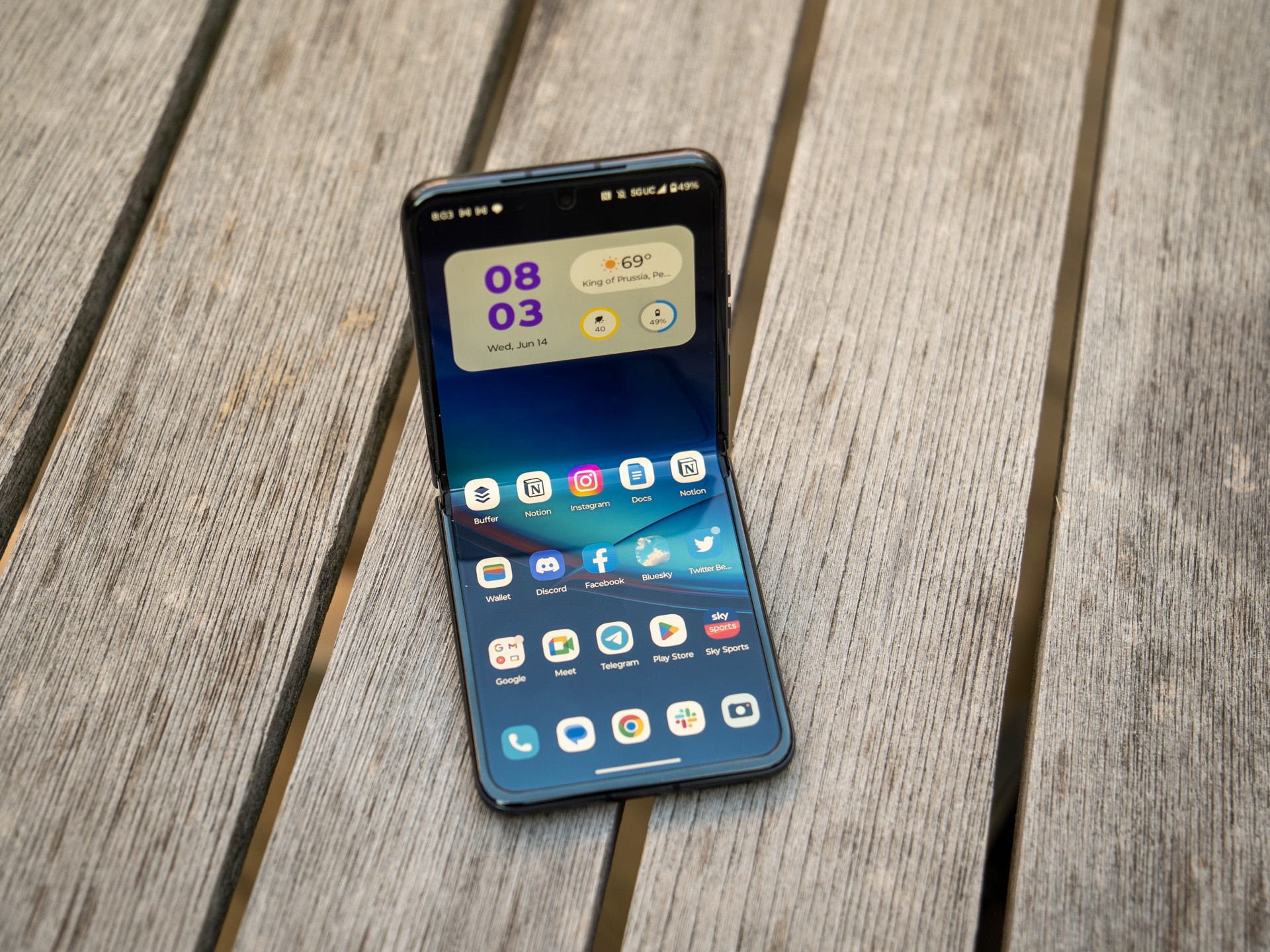
Small widgets, limited functionality, and the front display being an afterthought were all traits that Motorola had to evaluate and revolutionize. In doing so, we essentially have two phones in one. One is a regular smartphone that is more than capable, especially as the 6.9-inch display offers a 165Hz refresh rate, which makes browsing a joy.
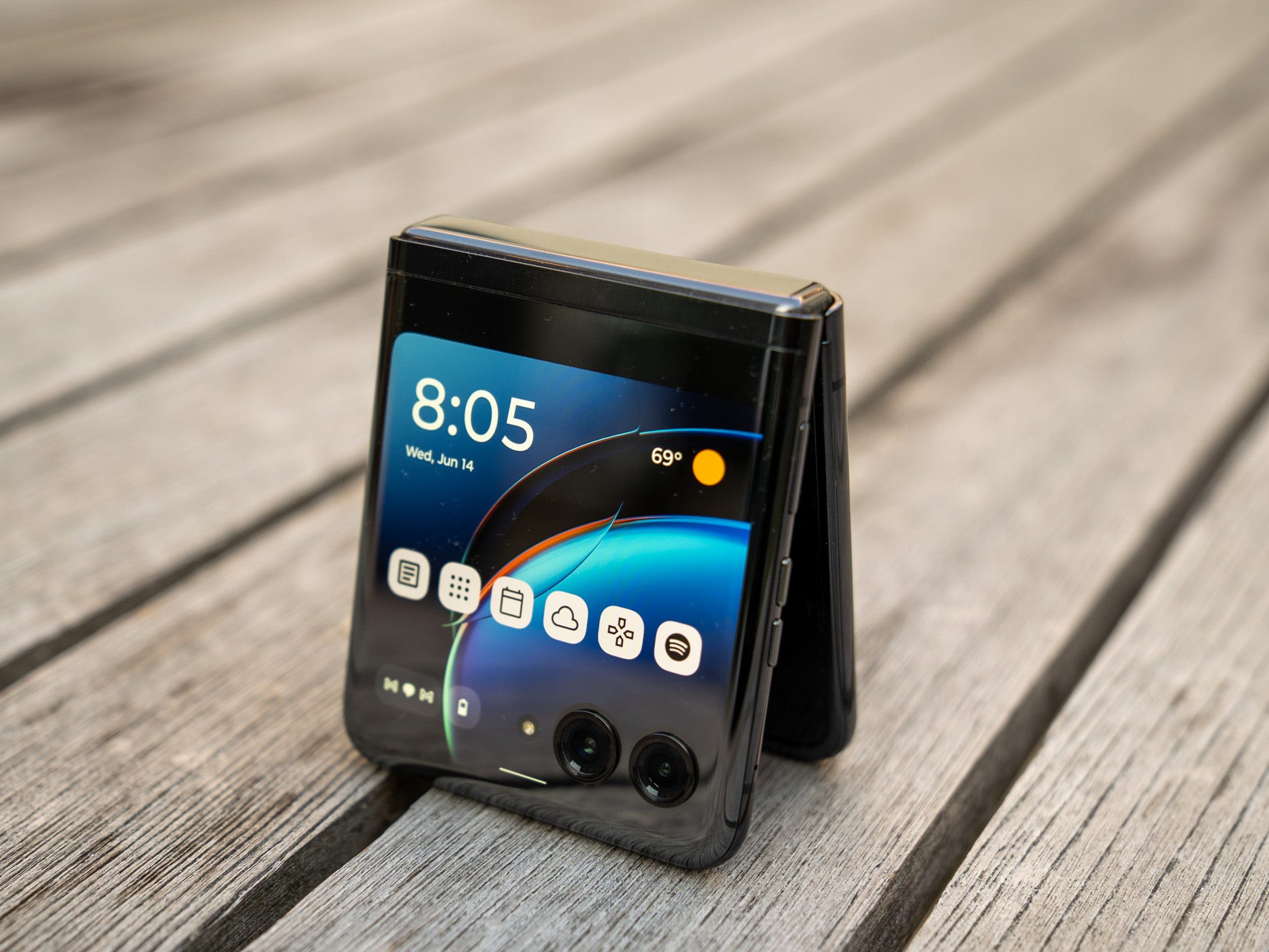
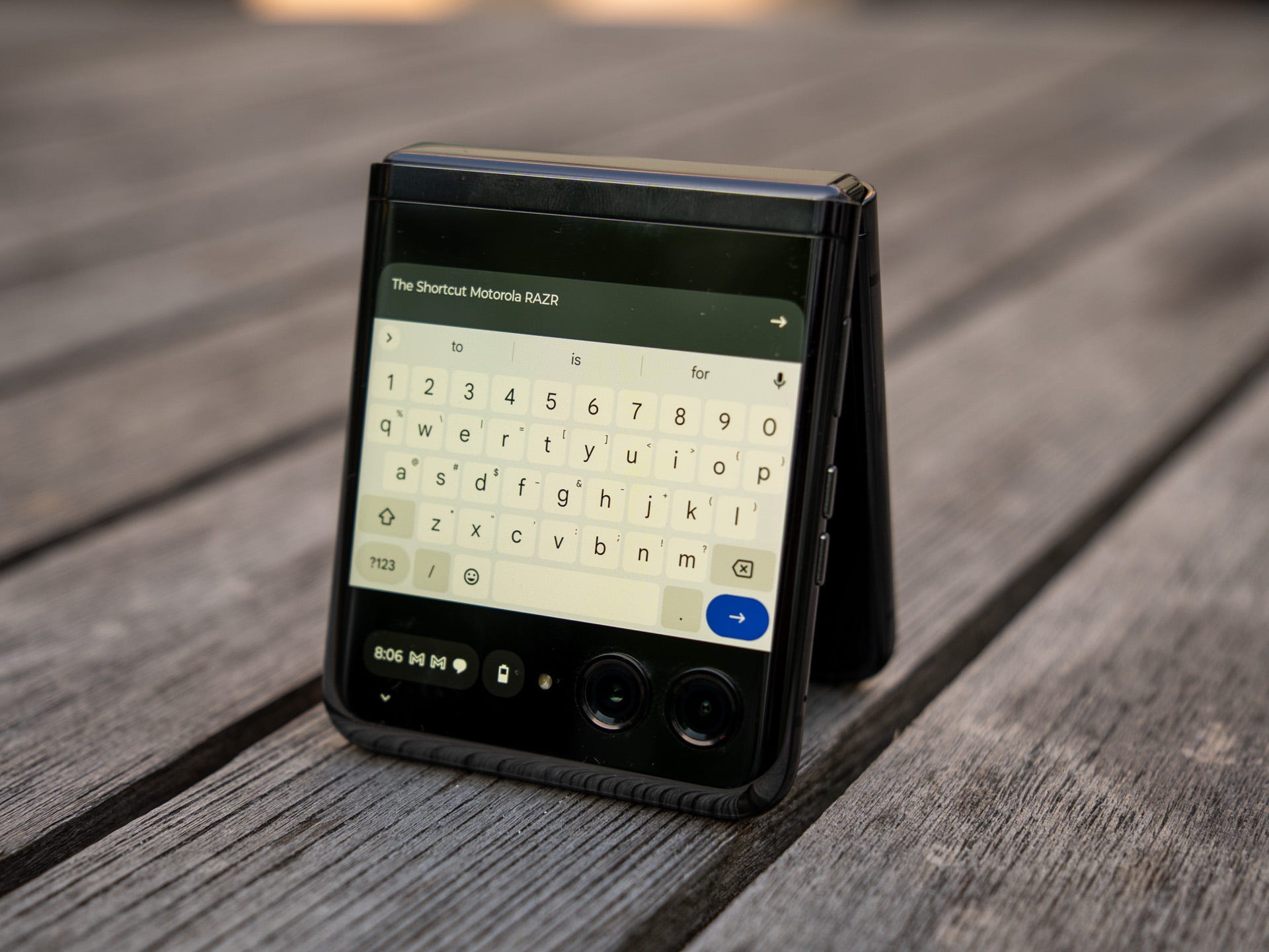
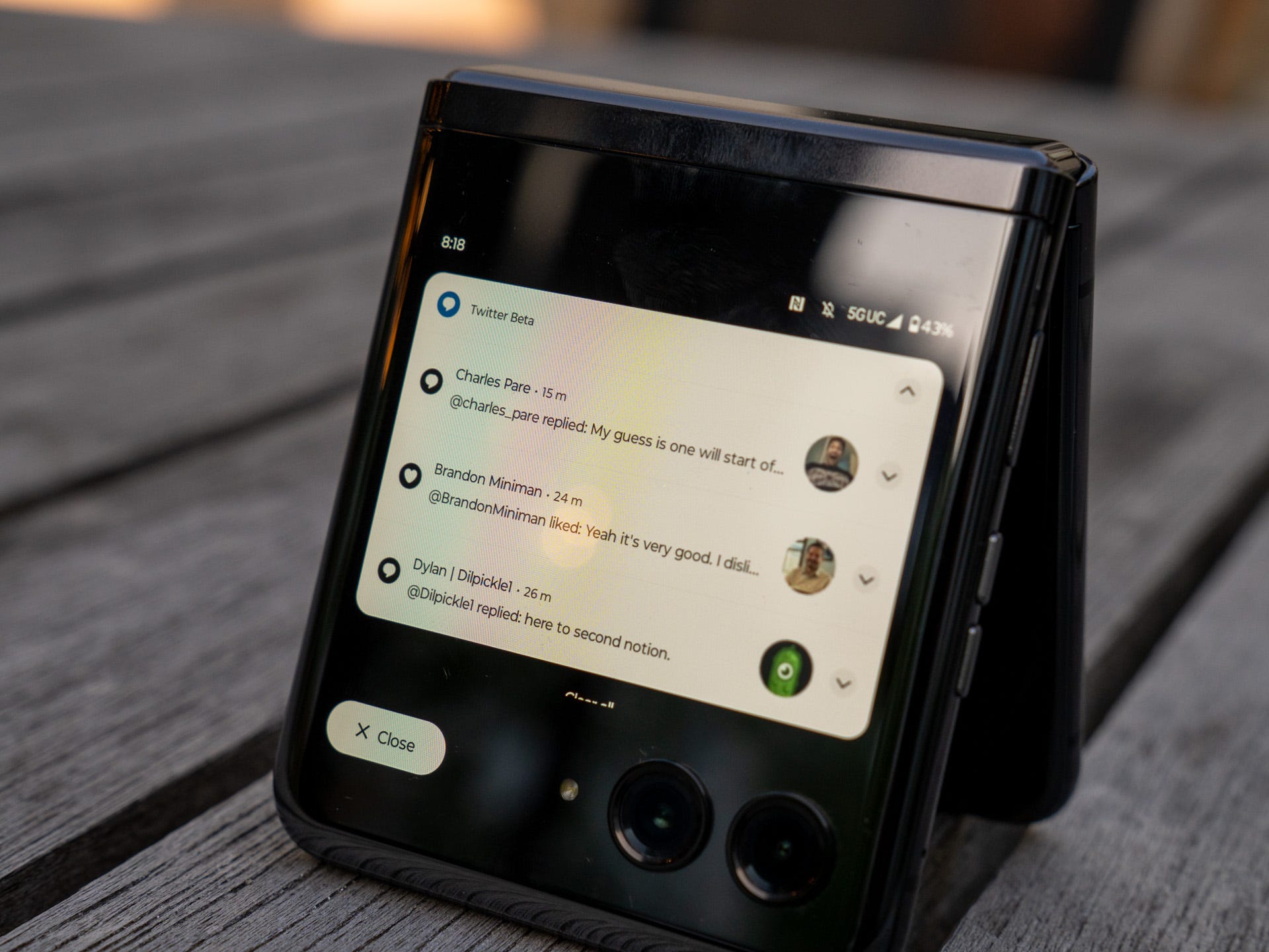
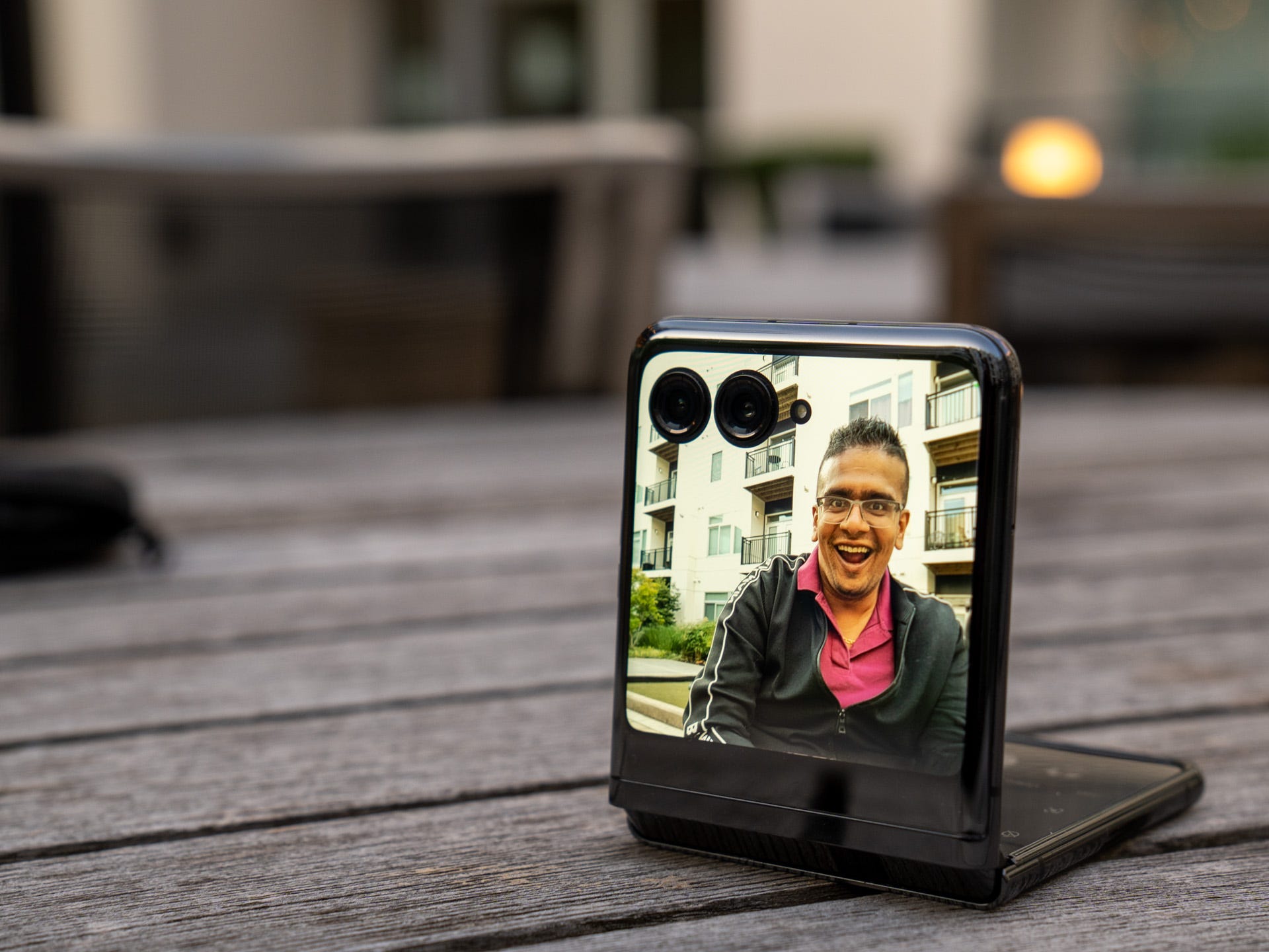
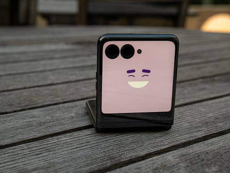
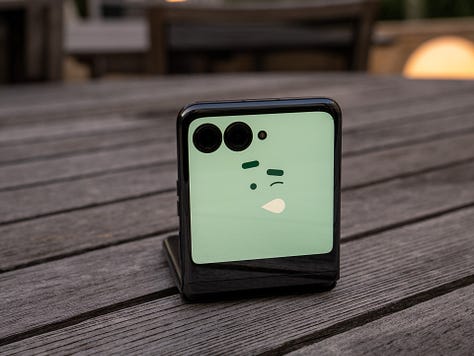
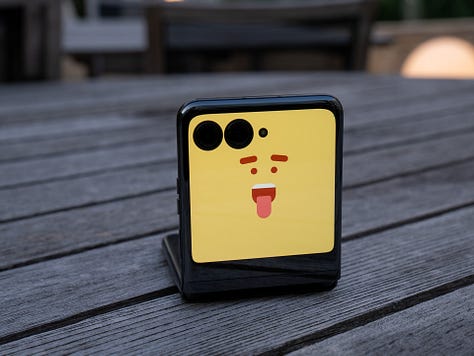
Not that you’ll use it a lot: the Cover Display on the Razr+ is the real star of the show. The ability to offer a regular or expanded app window on the 3.9-inch Cover Display means you’ll use that a lot more than you think, and the 144Hz refresh rate means you’ll use it a lot more. It’s an absolute joy to use, and it’s my go-to way of triaging notifications on the go.
It’s not all work though: the Razr+ is also made for play. There are a couple of first-party Motorola-made games that work on the Cover Display, including the Labyrinth-inspired Marble Mayhem, as well as a few preloaded games from GameSnacks, which is owned by Google. The more people you know with the Razr+, the more time you’ll be sucked into a series of challenges, especially with the Stack Bounce game.
We had a competition amongst several folks reviewing the Razr, and a competition between Joe Maring (~80,000) and Michael Fisher (183,203) was abruptly ended by Tim Schofield, who clocked in with 255,656. That’s not for lack of trying; I’m fairly certain that I (and others) spent far too much time trying to top these scores. The Cover Display is also perfect for those mundane moments in life, such as the doctor’s waiting room, where you have a few minutes and need something to pass the time.
The Motorola Razr+ isn’t perfect, and some of the problems could have been avoided. While the new teardrop hinge allows the phone to be thin and also fold completely flat with no gap, Motorola hasn’t added any real form of water resistance. The IP52 rating means it does offer some protection against both dust and water, but the lower second number means I am scared to use in even the slightest of rain.
There are also some antenna issues causing drain, and overall, the network performance is far less stable than most other phones I’ve used. On more than one occasion, it had no service using a T-Mobile eSIM, whereas virtually every other phone I’ve used – including some China-only devices that lack some of the network bands used by US carriers – performed better in the same location.
The design of the phone also means that the Motorola Razr+ is great for taking photos, but some of the camera features mean those photos won’t always be great. The ultra-wide-angle camera lacks OIS, and the field-of-view is so wide that your palm will occasionally get in the way of group selfies, especially if you’re right-handed. The camera also isn’t as good as the Galaxy Z Flip 4, but it’s more fun to use, which helps with the overall experience.
Razr+ makes selfies fun, which makes you want to take more photos.
That said, the camera is so fun that it somewhat compensates for it, and it definitely takes better selfies in this mode than any regularly-designed smartphone. More importantly, the uniqueness of the Razr means others will naturally be drawn to be part of your photo like you are when someone has a Polaroid Instant camera.
And that’s the thing about the Motorola Razr+: there are some flaws, but it’s so much fun that you forgive more than you would with any other phone. The Cover Display is what makes this phone stand out, and it’s the most fun I’ve had with a phone since the original Galaxy Fold form factor. It’s taken Motorola a few years to get it right, but we finally have what feels like the right evolution of the Razr franchise.
After using the Razr+, my iPhone 14 Pro feels dull and uninteresting.
All new gadgets have a certain luster to them, but most of them wear off within 7-10 days for me. Two weeks in, I’m still in love with the Motorola Razr+ (mostly because of the Cover Display) and reach for it by default. While my main SIM remains in the iPhone 14 Pro – mostly because of certain health integrations with the Apple Watch – the Razr+ is the phone I turn to more than most.
Motorola Razr+ specs
💰 Price: $999
📺 Cover Display: 3.6-inch pOLED, 1066 x 1056 pixels
🖥️ Main Display: 6.9 inches, 22:9 aspect ratio, 413 PPI, 2640 x 1080 pixels
📸 Rear Camera 1: 12MP wide with OIS, PDAF, 1.4µm pixel size, f/1.5 aperture
📷 Rear Camera 2: 13MP Ultra-wide with f/2.2 aperture and 1.12µm pixel size
🤳 Camera (front): 32MP
⚙️ Chipset: Qualcomm Snapdragon 8+ Gen 1
🐏 RAM: 8GB (LPDDR5)
🗄️ Storage: 256GB
🔋 Battery: 3,800 mAh
🔌 Charger: 30W fast charging, 5W wireless charging
📶 Connectivity: Wi-Fi 6E, Bluetooth 5.3
👇 Fingerprint sensor: Yes, built into the power button
📐 Dimensions: 170.8 x 74 x 7 mm (unfolded), 88.4 x 74 x 15.1 mm (folded)
⚖️ Weight: 189g
🌈 Colors: Black, Glacier Blue, Viva Magenta
🤖 OS: Android OS 13
Motorola Razr+ review in-depth
Want to dig deeper into the Motorola Razr+? Keep scrolling! ⬇️
Motorola Razr+ price
💰 A high starting price. The Motorola Razr+ costs $999.99 before any offers, and to some people, this will be too much. It’s on par with the starting price of the Galaxy Z Flip 3 and Galaxy Z Flip 4 over the last two years, but Samsung had much stronger trade-in deals directly on its site. By comparison, Motorola itself has really poor trade-in deals.
🤑 Some great deals to save BIG! That said, there are some great deals with carriers. T-Mobile will give you a Motorola Razr+ for free with a trade-in and has the Viva Magenta color as an exclusive, while AT&T will sell you one for $5 per month without a trade-in. Google Fi and others all have a range of deals to save you money, but if you want a good deal without going via any carrier, you’re out of luck, sadly.
Two displays = Two phones in one
✌️ Two displays with high refresh rates. There are TWO displays on the Motorola Razr+. Both have a great refresh rate – 165Hz on the main display and 144Hz on the Cover Display – and make text look great. Unlike any other foldable, you can run any Android app on the Cover Display, which means you have two phones in one.
📲 The best thing about the Motorola Razr+. As good as the front display is, the Cover Display is the real winner. Whether it’s using the keyboard to triage and reply to notifications while on the go, playing games when you have a few minutes of downtime, or taking a ton of selfies, this is the reason to buy the Motorola Razr+. When you try it, you’ll most likely fall in love with it, just like I did.
📶 It struggles as a phone. That said, the Motorola Razr+ is a phone, and it does struggle with some network issues. The modem and antennae seem to be weaker than any other phone I’ve used – including some phones imported from China that don’t support all the bands used by US carriers – and there is an impact on the battery. While it is still 100% usable and has improved after a few days with the phone, it’s still something to be aware of, especially if you live in an area with a spotty cell signal.
Motorola Razr+ design
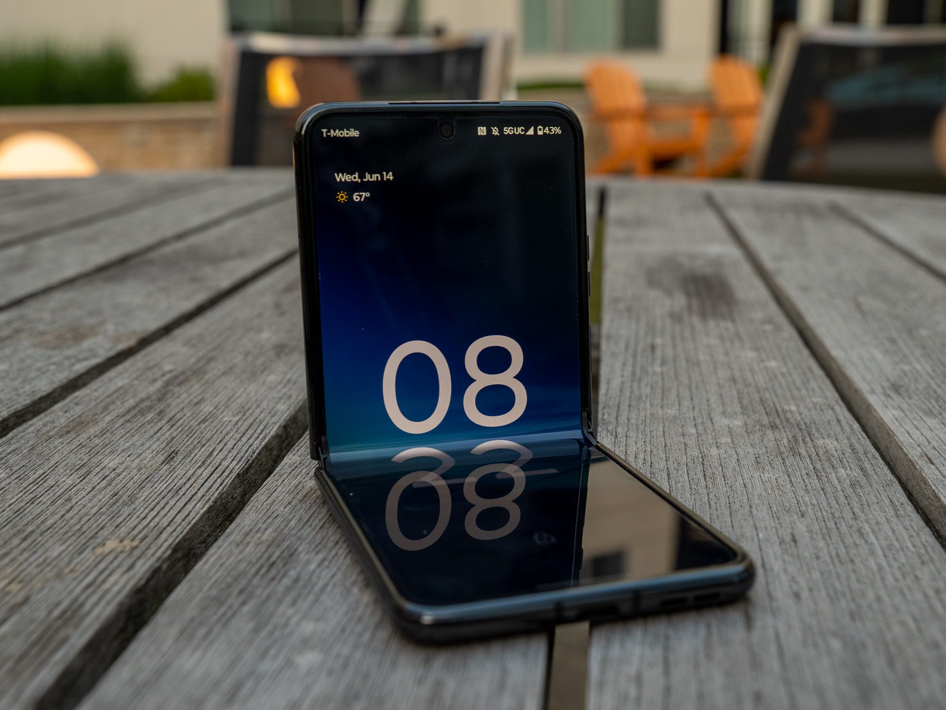
🤌 Impossibly thin. It’s absolutely crazy just how thin the Motorola Razr+ is and just how light it feels. When unfolded, this is one of the thinnest phones I’ve ever used, and it feels really light. The weight distribution is fantastic, and it feels very premium.
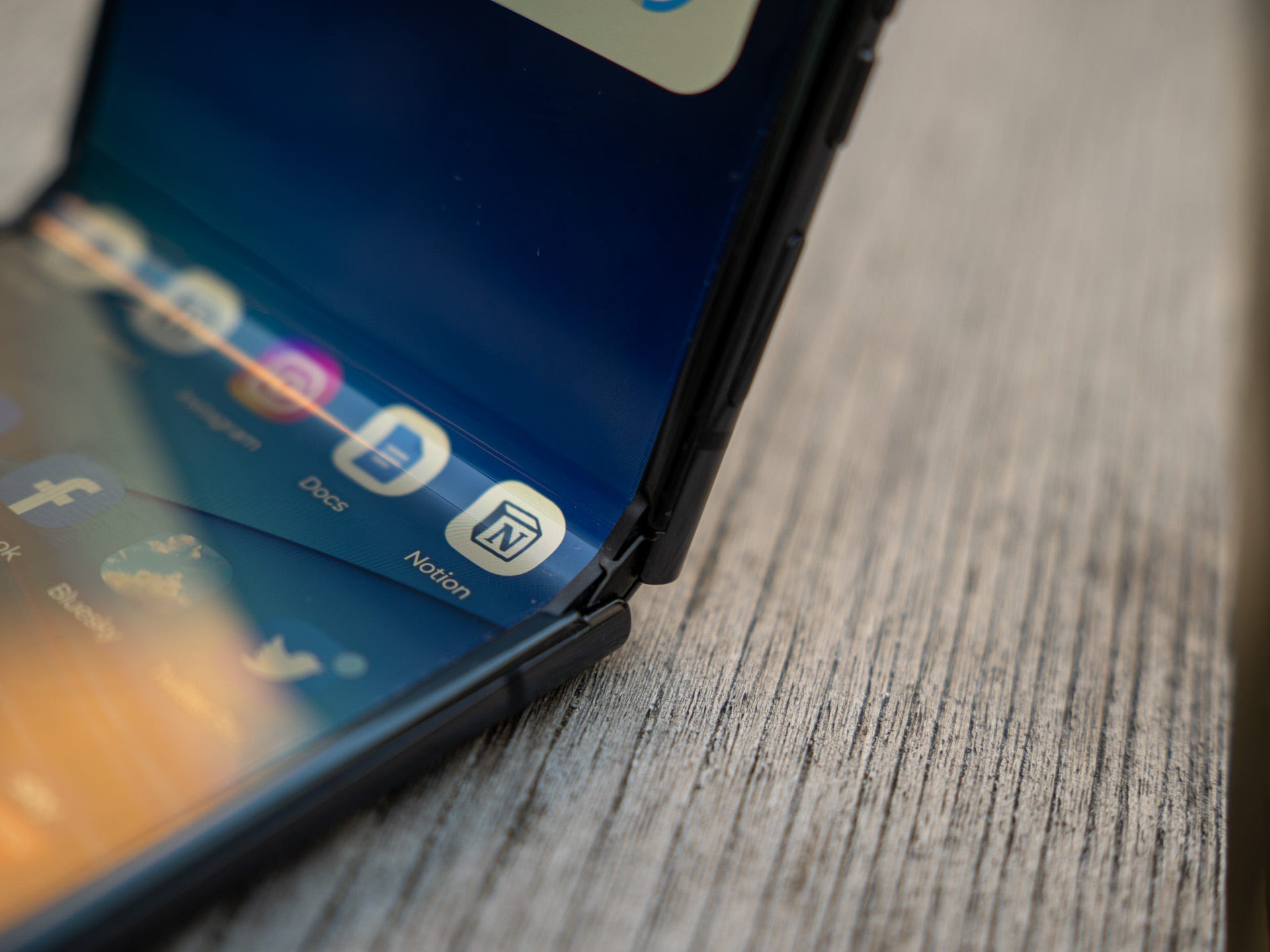
⭐ Virtually crease-less screen. Thanks to the excellent teardrop hinge, the screen is virtually crease-less, and it’s an absolute joy to use. You quickly forget that there is a crease, and it doesn’t get in the way at all during day-to-day usage. It’s one of the best implementations of a crease on a foldable design to date.
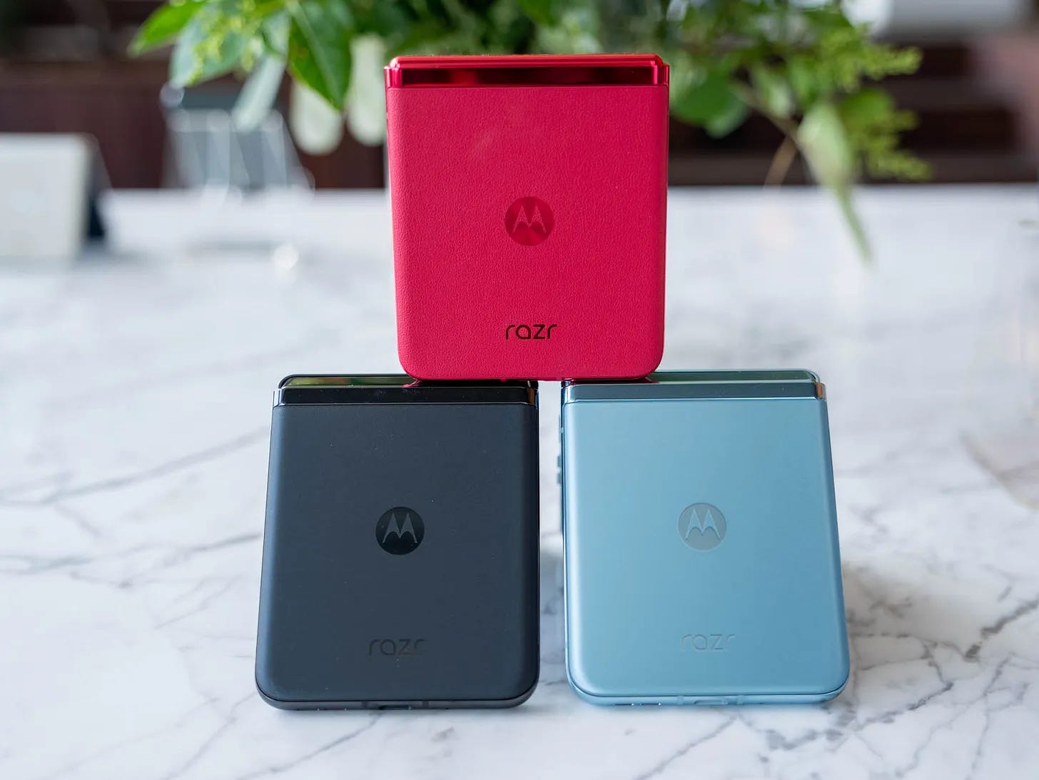
🌈 Viva (las) Magenta! There are three excellent colors: the Black and Glacier Blue – which feature a frosted glass black with a matte finish – and the Viva Magenta, which is exclusive to T-Mobile and has a vegan leather finish. As nice as the Black and Blue colors are, the Viva Magenta is truly special, and I highly recommend it as the color to choose if you want to stand out and you’re buying either from Motorola or from T-Mobile.
Motorola Razr+ battery life
🔋 Good (enough) battery life. If you need all-day or multi-day battery life, you may end up disappointed, especially if you end up using the main display more than the front. On average, the 3,800mAh battery gets me 3-4 hours of Screen on time using the main display with a further 2-3 hours using the front display. It's more than good enough for most people, and I don't have any real qualms with it.
🔌 Fast (enough) charging. When it does run low, 30W TurboPower fast charging will recharge the Razr+ in about 1 hour and 15 minutes. 5W wireless charging is also present, but it's a lot slower, although still a good option for overnight charging. Check out our TurboPower charging test below!
Motorola Razr+ performance
🗄️ Good base storage. In the US, the Motorola Razr+ comes with 256GB of storage as the only option. That's more than enough for virtually everyone, and you won't need to worry. There’s no expandable storage – like most phones right now – and it’s a little frustrating that the US Razr+ doesn’t come with a 512GB storage option like the international version, which is dubbed the Razr 40 Ultra.
⚙️ Snappy performance with enough RAM. The Qualcomm Snapdragon 8+ Gen 1 processor is half a year older than the current 8 Gen 2 flagship processor but doesn't miss a step. Motorola likely opted for this as the latest Gen processor adds a lot to the cost, and while that would have improved battery life, this processor does a good enough job. 8GB of RAM is good enough, although the Motorola Razr 40 Ultra does offer 12GB of RAM as standard. It costs more, so it's a fair trade, in my opinion.
Cameras
I love the Motorola Razr+ cameras. Although they're not perfect, they do make taking photos fun, especially when there are many of you. I have a camera deep dive coming in the next few days, but here's the good, the bad, and the great! ⬇️
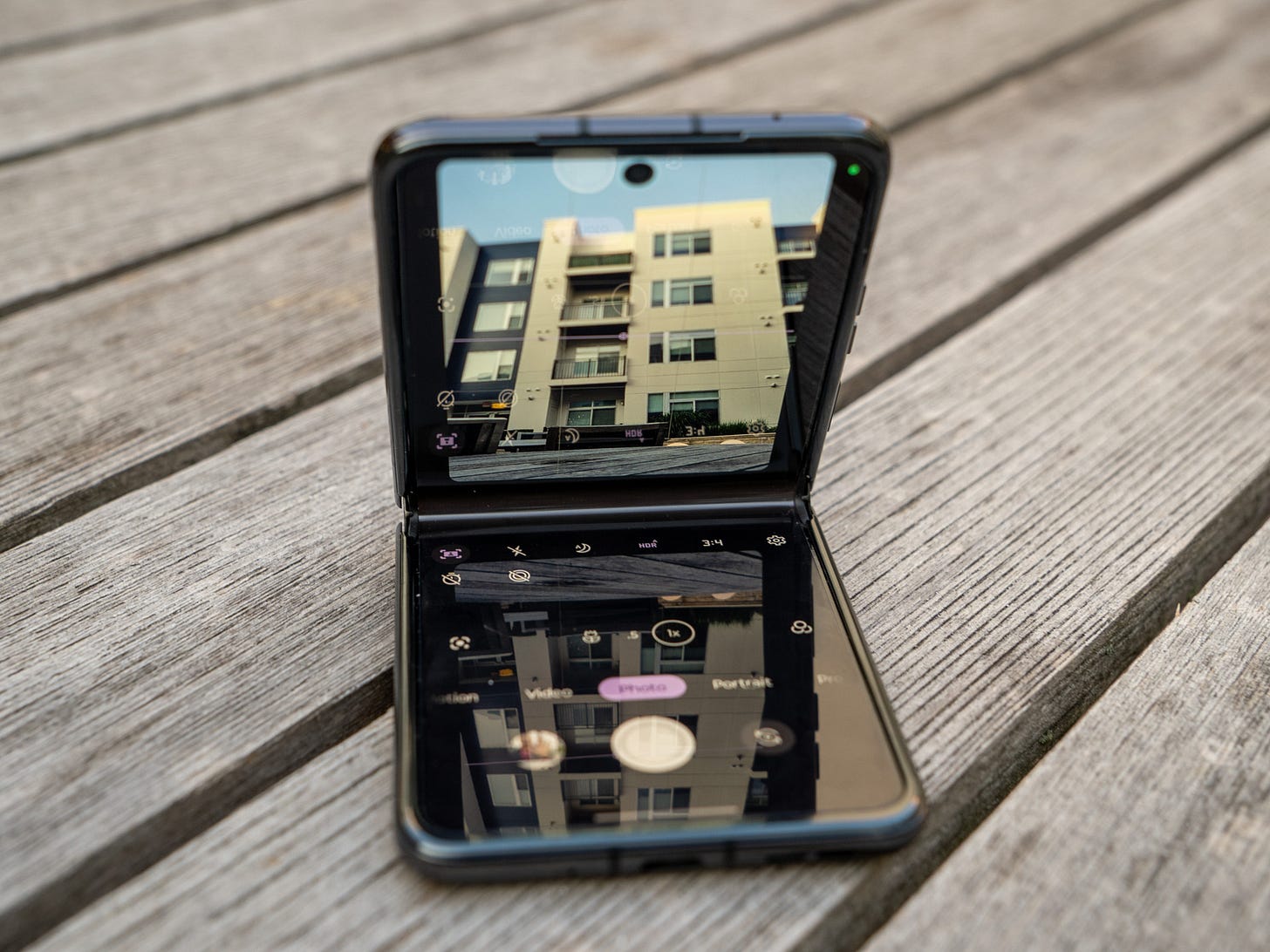
🤳 The best selfie camera. If you love taking selfies, especially in a group, look no further: the Motorola Razr+ is the killer selfie phone. Not just that, but it's also great for vlogging, taking pictures of other people where they're in charge of the shot, and for selfie video recording (hello, 4k)! All of this is down to the form factor and the hinge, which can stay open at any angle from 45° to 180° and gives you a lot of creative freedom.






📸 Wide-angle camera. The 12MP wide-angle camera has OIS, f/1.5 aperture, and 1.5um Pixel size. The result is good all-around photos, even though they are somewhat inconsistent. Post-processing can take some time, and there is a bug where it'll sometimes fail to save photos if you turn off the screen straight after taking the photo, although Motorola is working on a fix for this.




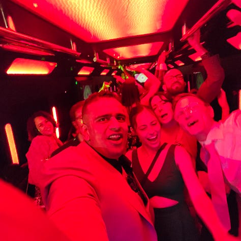

🌆 Ultra-wide angle camera. The lack of OIS on the ultra wide-angle camera means some shots can be a little blurry, especially when using it folded with the Cover Display. That said, it does a good job most of the time, and the form factor means that good photos in selfie mode are much better than any other selfie camera on the market.





👯♂️ Great for memories. This is why I love the Razr+ so much: because it's so unique, it catches the eye, and everyone wants to be in the photo. The result is better memories, especially in a celebratory environment like a wedding. A picture speaks a thousand words, and the Motorola Razr+ helps you paint a tapestry.
Motorola Razr+ software tricks
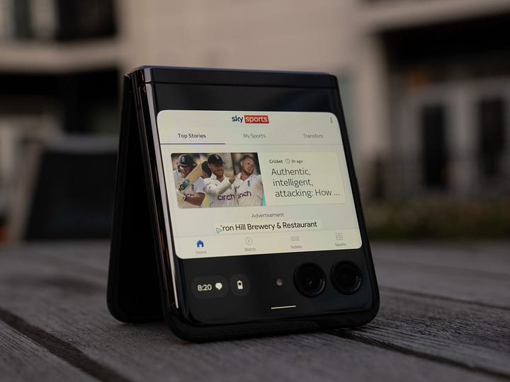
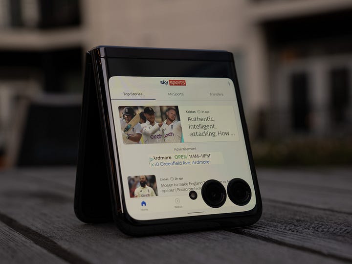
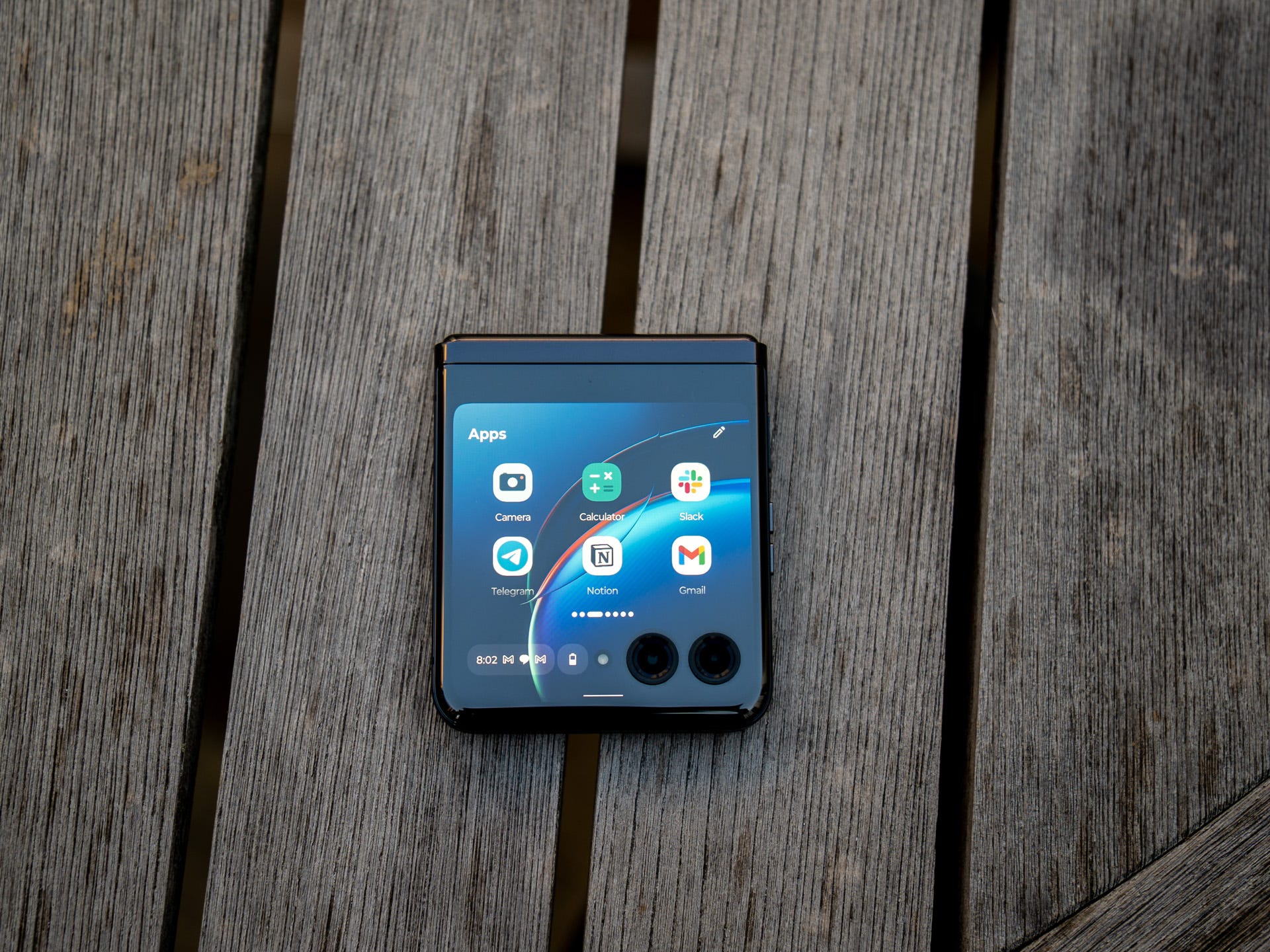
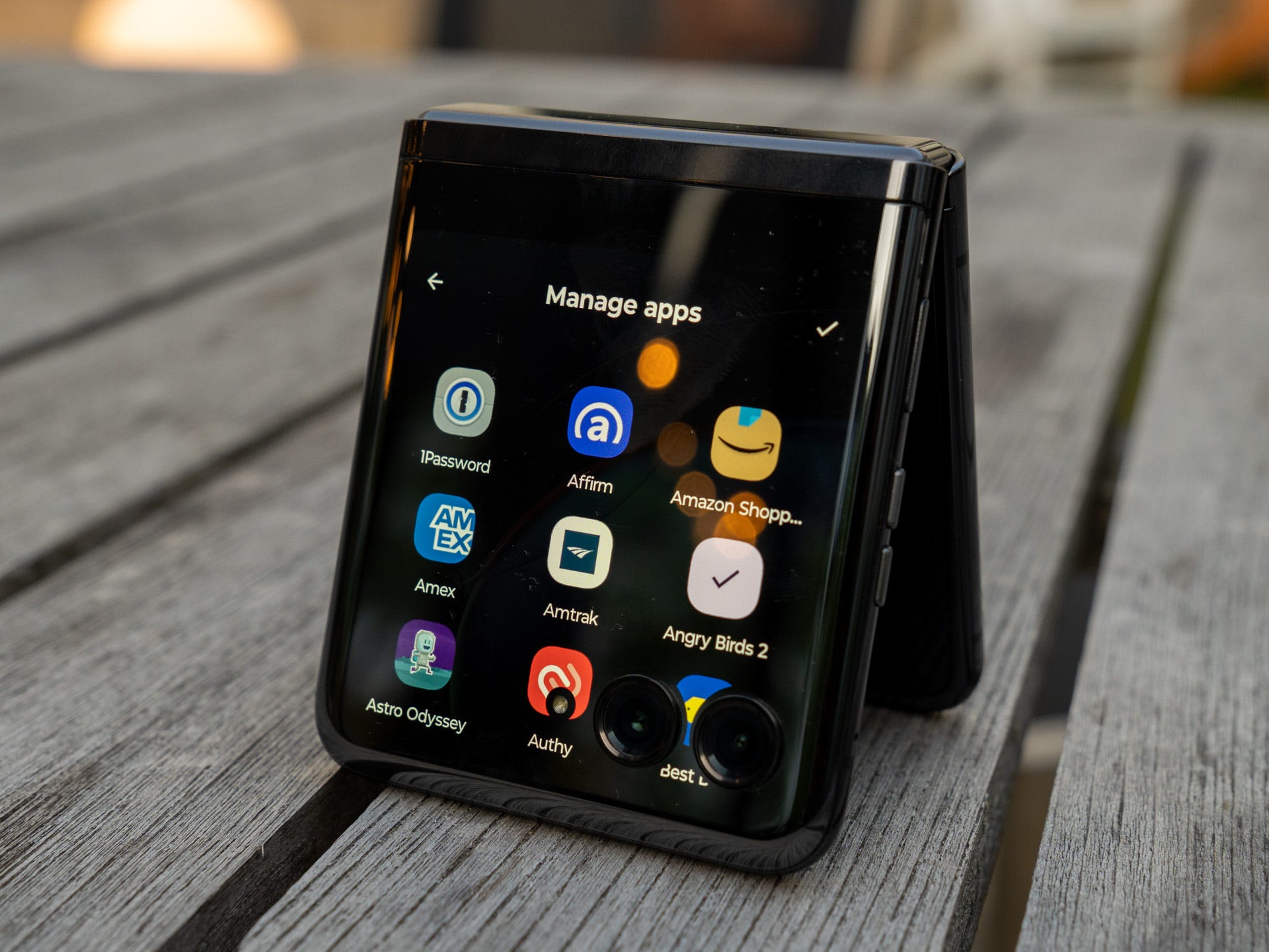
🤏 Piched version of the main display. If you're wondering what you can do on the Cover Display, here's a simple answer: everything. It's essentially a pinched version of the main display, and it's very well-optimized to be fully usable as a phone in its own right. Some menus in apps can be hidden behind the cameras, so Motorola also made it easy to switch to a more traditional windowed app just by holding the app switcher bar at the bottom for a hot second.
🪟 World of Panels! The Cover Display uses panels to highlight different widgets and apps. There's a panel for your calendar, the weather, Google News and Games. The panel I used the most is the Favorite Apps. Here you can pin any app (and a seemingly endless number of them), but I do wish you could sort them (they are added in the order you add them) and that there was an app drawer button to access something that wasn't pinned. Right now, if you want to access an app that isn't pinned, you first have to pin it, and I hope that Motorola can tweak this in a future update!
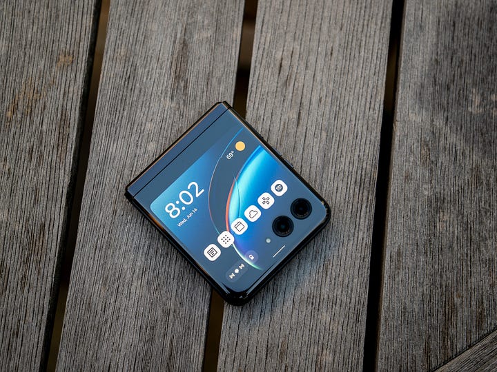
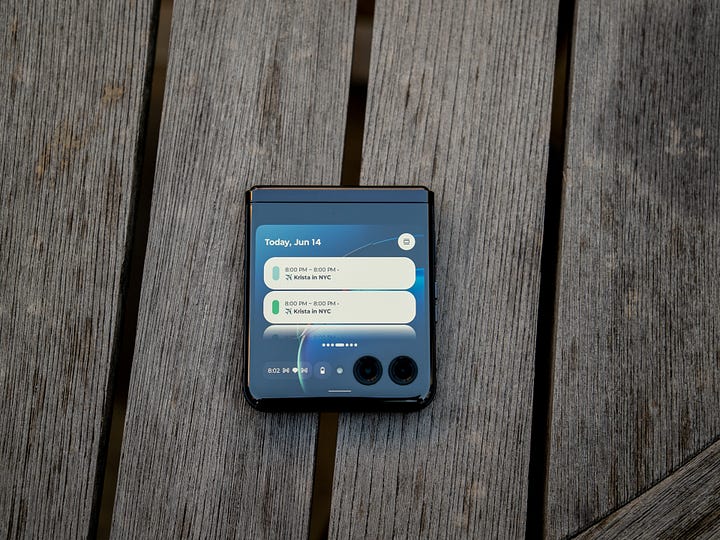
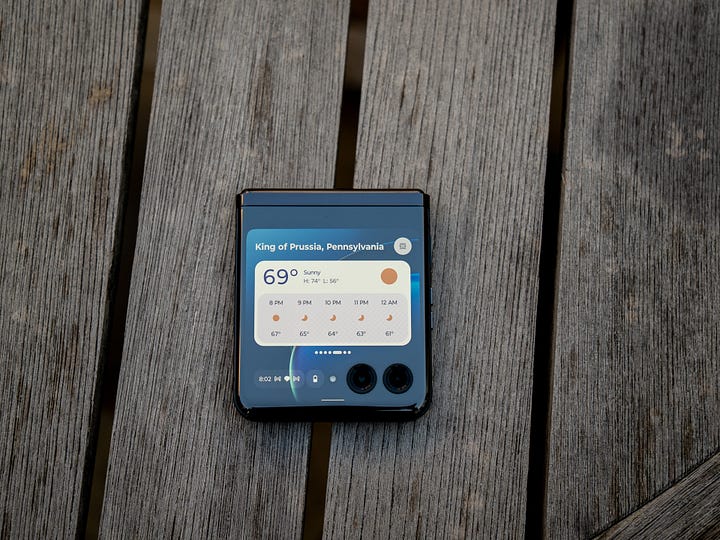
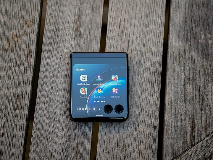
👋 Hello Moto! Like Samsung and multitasking on the Galaxy Fold, it feels like Motorola has been developing its gestures for years with the Razr+ in mind. A quick double chop of the phone feels like a really natural way to enable or disable the flashlight. A double twist of the wrist is an effortless way to launch the camera, so effortless that my muscle memory defaulted to trying this on other phones that don't support this feature. Holding your palm up to take a selfie is also super easy. Motorola has added to the mostly stock experience in little ways that make a big difference to the fun factor and usability of the Motorola Razr+.
Should I buy the Motorola Razr+?
I am madly in love with the Motorola Razr+. It's my favorite implementation of a flip phone, it makes taking photos fun, and I wouldn't hesitate to recommend it to most people. If the trade-offs are acceptable to you, look no further.
If you're not sure whether it's for you, here's who should and shouldn't buy the Motorola Razr+!
Yes, buy it if…
✅ You want an excellent flip phone
✅ You want the Cover Display experience
✅ You take a lot of selfies
✅ You lament the lack of small flagship phones
No, don't buy it if…
❌ Battery life is most important to you
❌ You want to zoom on the camera
❌ You spend a lot of time in dusty, rough, or wet environments


