The new Motorola RAZR+ is here and I'm in love with Motorola's first great foldable
There are two new Motorola RAZR phones this year, and the RAZR+ sets the standard for flip phones to come this year.
Ask most people about their favorite Motorola memory, and the RAZR will come to mind. No, not the foldable RAZR launched in 2019 or the subsequent follow-ups in 2020 and 2022, but almost 20 years ago. The RAZR V3 still remains one of the most iconic devices ever made, and on its fourth attempt at remaking the RAZR, Motorola may have just ticked the boxes I’m looking for.
The Motorola RAZR 2022 was launched in China and some other global countries – including the UK where I picked mine up last year – but crucially, it didn’t come to the US. Instead, Motorola was waiting for something a little more special, and the new Motorola RAZR definitely delivers. In fact, it delivers twice over.
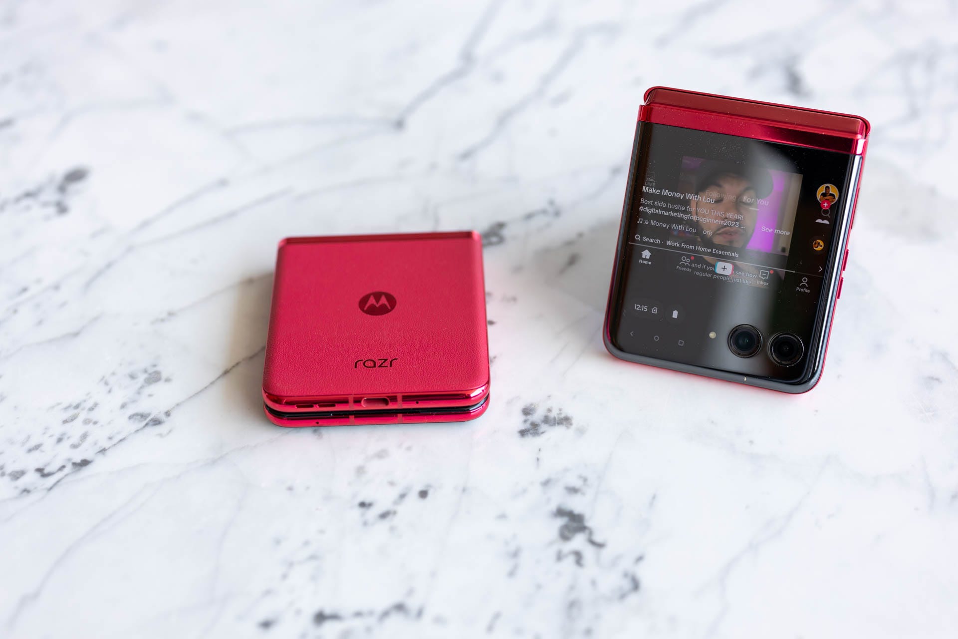
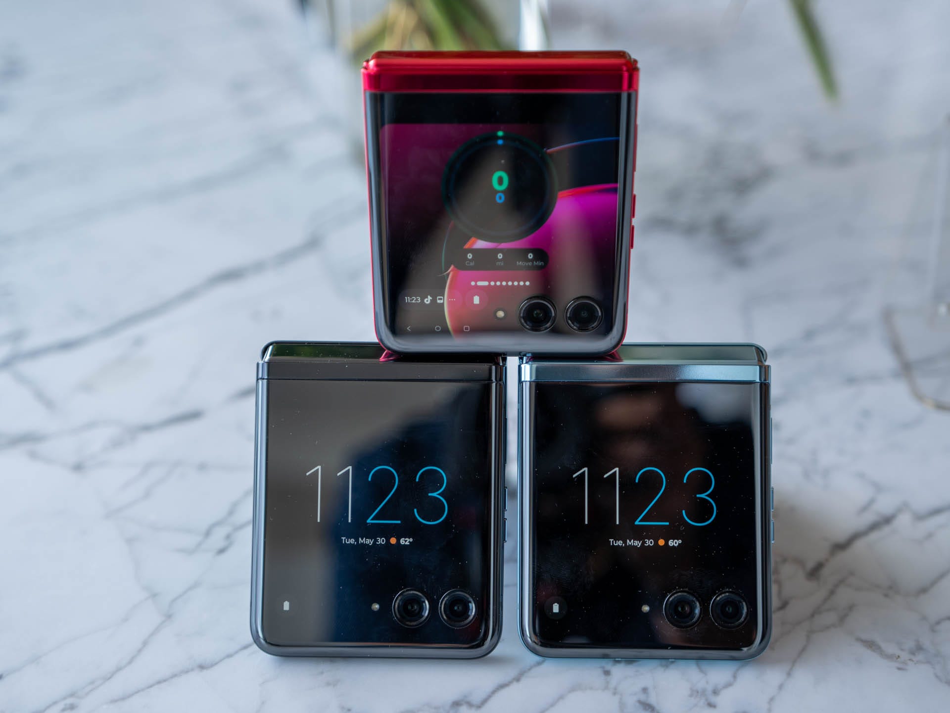
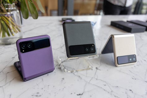
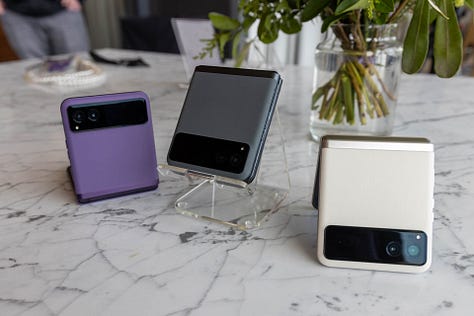
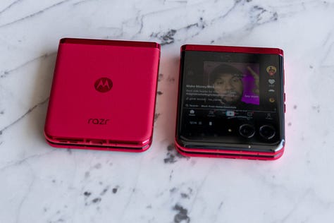
This is the new Motorola RAZR+… and next to it, is the new Motorola RAZR. Two phones, one shared DNA, and a lot of the things necessary to hopefully make a splash. I spent an hour and a half with both new RAZR, and I’m in love.
Design & Hinge
I LOVE the design of the new RAZR, the RAZR+ to be precise. The front screen is fantastic and has an incredible array of specs and features to keep anyone happy (more on that below). In comparison, the regular RAZR features a much smaller – and therefore limited – external display that still serves a purpose.
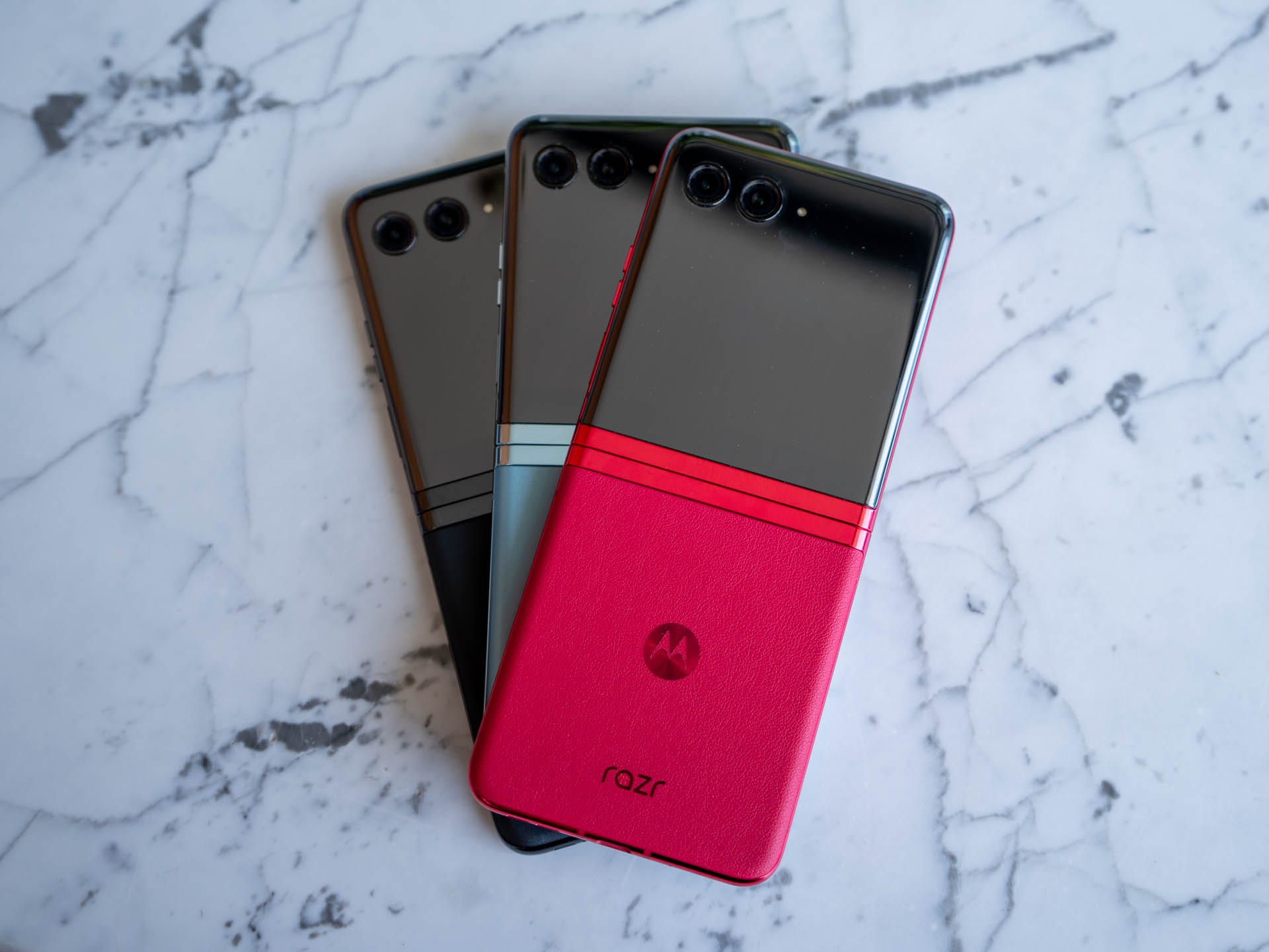
Fans of the iconic RAZR chin will immediately notice that it’s no longer there with Motorola opting for a more uniform look that provides the largest display possible on the front, and creates a borderless look when you’re using the rear display. This decision is a smart one, and Motorola has made some interesting tweaks to the user experience to ensure that you won’t miss the chin.
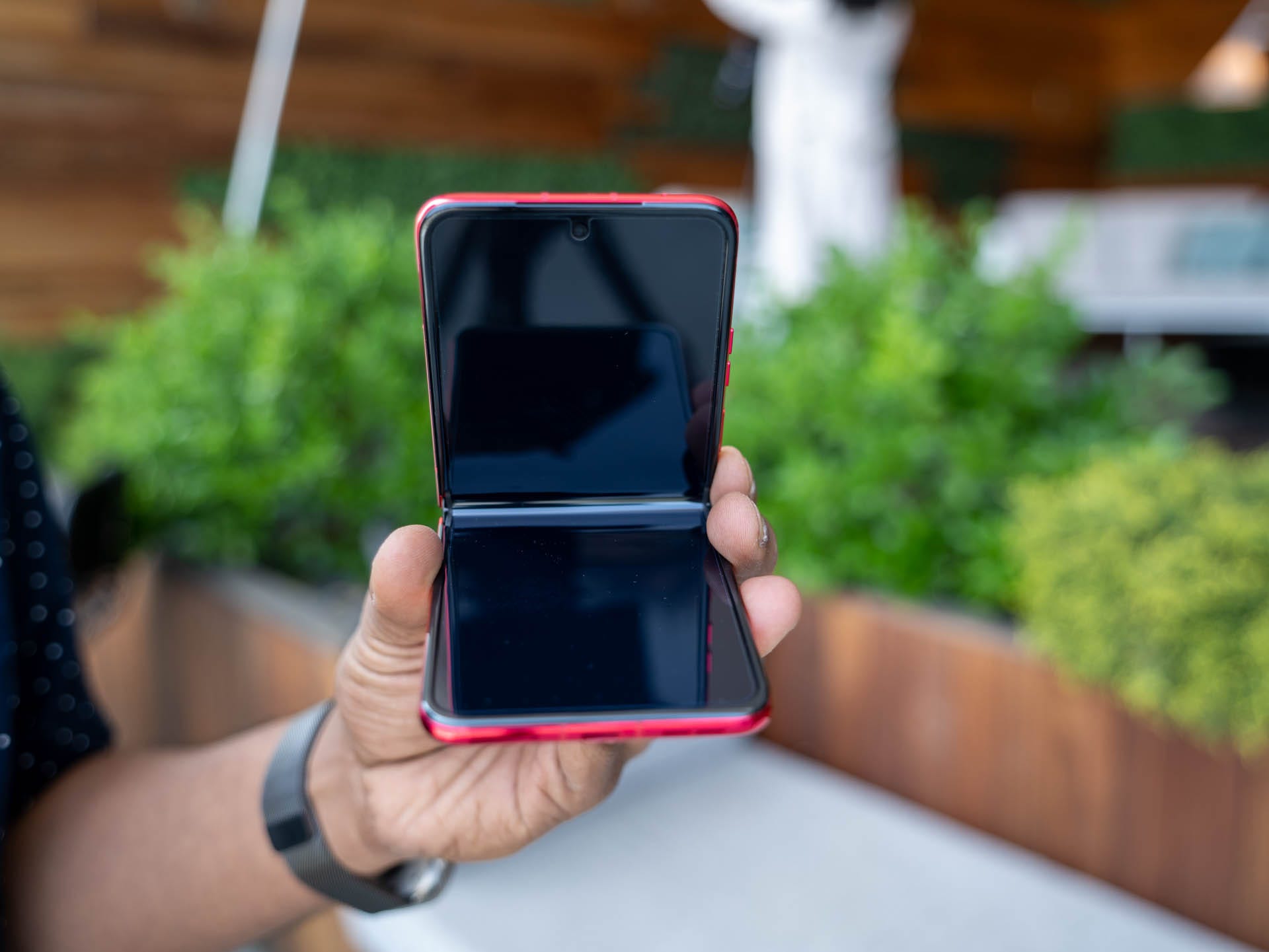
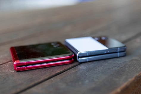
The redesigned front display is joined by a redesigned hinge, which is much smaller with no gap when the phone is closed. The net result is that it mostly features a creaseless design on the main display, although this is still somewhat noticeable. Having used foldables as one of my daily drivers for the best part of a few years, I really don’t care about the crease and it doesn’t hamper the daily experience in any way.
Like most foldable phones, the fingerprint sensor is located on the power button on the right of the phone. This, and the volume keys, provide enough travel to give solid tactile feedback.
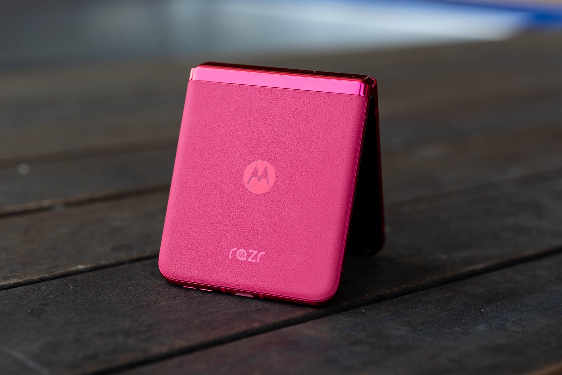
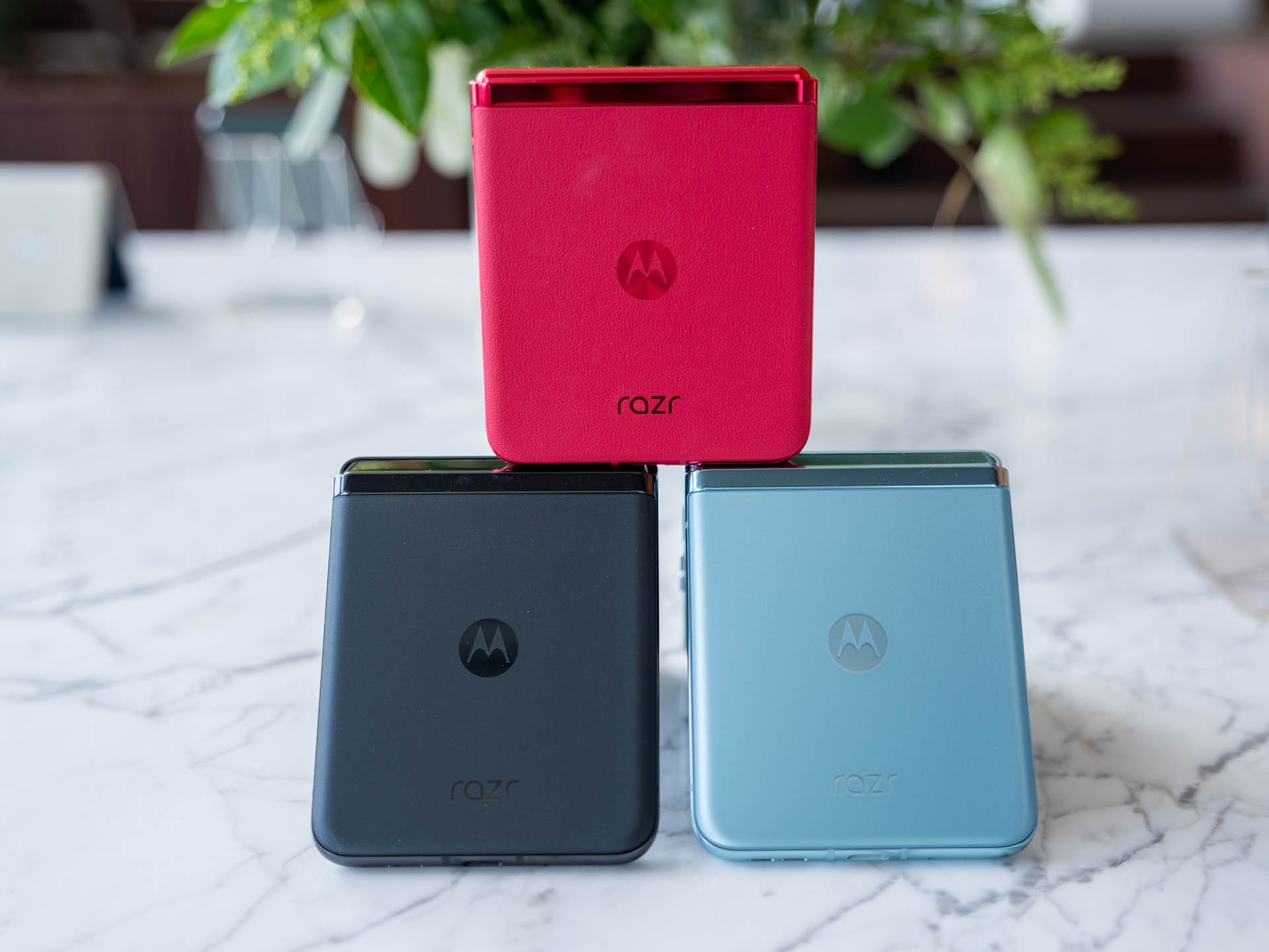
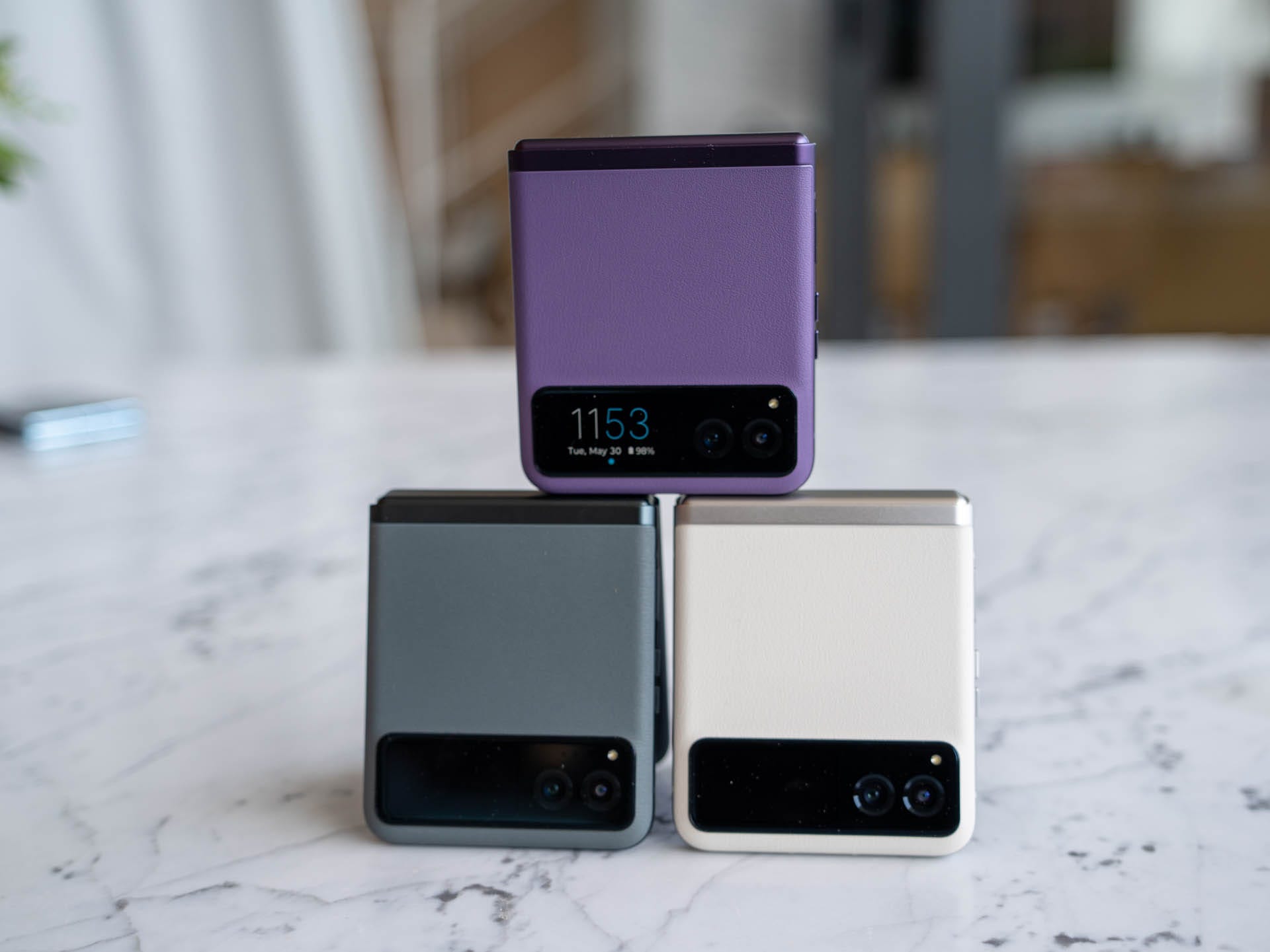
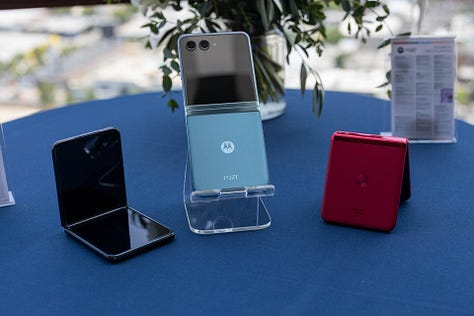
Aside from the display – which is fantastic and I’ll cover below – both devices also come in a range of absolutely gorgeous colors. The RAZR+ is available in Black, Glacier Blue, and Viva Magenta (which is my absolute favorite), while the RAZR comes in Sage Green, Vanilla Cream, and Summer Lilac. The Black and Blue RAZR+ have a glass back with a matte finish, while the Viva Magenta (and all of the regular RAZR models) use a Vegan Leather that is plush, and an absolute joy to hold.
Displays
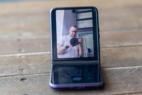
The standout feature of the RAZR+ is the pOLED front display, which measures 3.6 inches, supports HDR 10+, and has a 144Hz refresh rate. The refresh rate is great as it makes it perfect for gaming, with Motorola offering some games out of the box. In comparison, the RAZR features a smaller 1.5-inch pOLED display.
My favorite is Marble Mayhem, a ball-in-a-maze style game that you can play using nothing more than the accelerometer on the phone and you complete a level by getting the ball into the hole, which just happens to be the camera. Other games include Astro Odyssey, Scooter Xtreme, Tiger Run, Stack Bounce, and 99 Balls 3D.
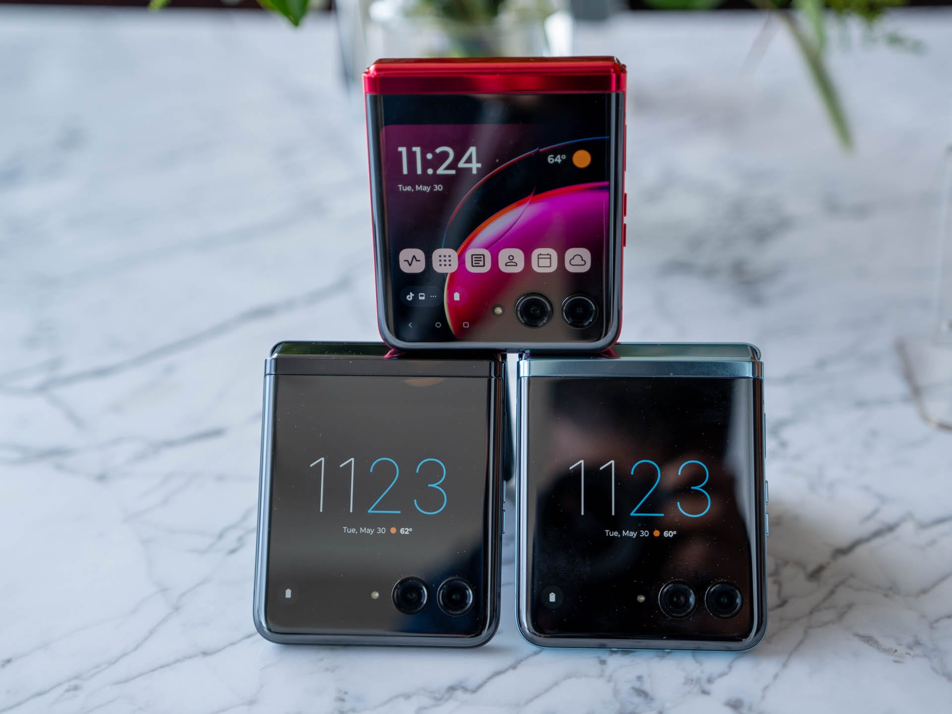
The front display on the RAZR+, and the RAZR, come with a range of panels that offer widgets and access to information. Swiping left and right lets you scroll through the panels which include Weather, Calendar, the latest from Google News, your Google Fit metrics, favorite contacts, games, and shortcuts to your favorite apps. Motorola also partnered with Spotify to develop the perfectly sized and optimized Spotify Widget for the front screen.
Like the past few generations of the foldable RAZR, you can also run any app on the front screen, and the RAZR lineup still remains the only foldable phone to offer this right now. You can also view any notification and even reply to them using the full keyboard – yes, that’s right: there’s a full touch keyboard that supports swipe gestures, and having tried it out, I’m fairly certain I will use this feature all day every day.
On the inside, both models have the same 6.9-inch FHD+ pOLED display with HDR10+ support, 22:9 aspect ratio, and a 165Hz refresh rate with LTPO technology so it can dynamically adjust all the way down to 1Hz depending on what’s on the screen. Like other foldable, you can start an app on one of the displays and easily continue on the other display, and it’s really simple: when you switch to the outer display from the main display, you simply tap the Continue button.
Motorola is known for well-thought-out software and the new RAZR is no different. In order to maximize the utility of the front display, they've added a feature so the display can either stop above the cameras or it can flow around the cameras.
Hardware
Both devices feature all the specs you would expect from a flagship, with slight differences between the two models in a couple of key areas. The RAZR+ is powered by a Snapdragon 8+ Gen 1 processor with 8GB of RAM and 256GB of storage, whilst the RAZR is powered by a Snapdragon 7 Gen 1 processor with 8GB of RAM and 128GB of storage. Both are also IP52 rated offering some protection against dust and water, albeit we don’t recommend submerging either phone in water.
The RAZR+ is powered by a 3,800mAh battery whilst the smaller display on the RAZR means more room for the larger 4,200 mAh battery. I would expect that the regular RAZR will have better battery life but the RAZR+ should offer solid battery life, especially as you’re more likely to use the front display given everything it’s able to do.
Neither comes with a charger in the box, but they do support 30W TurboPower charging (any charger capable of 30W charging will work) and 5W wireless charging. Bringing wireless charging to the RAZR family solves one of my biggest pet peeves with the previous generations.
Camera
Like the battery, the smaller display on the RAZR gave Motorola more room to use a bigger camera. The regular RAZR features a 64 MP main camera while the RAZR+ features a 12MP camera. Both also feature the same 12MP Ultra-wide camera that doubles as a macro camera as well.
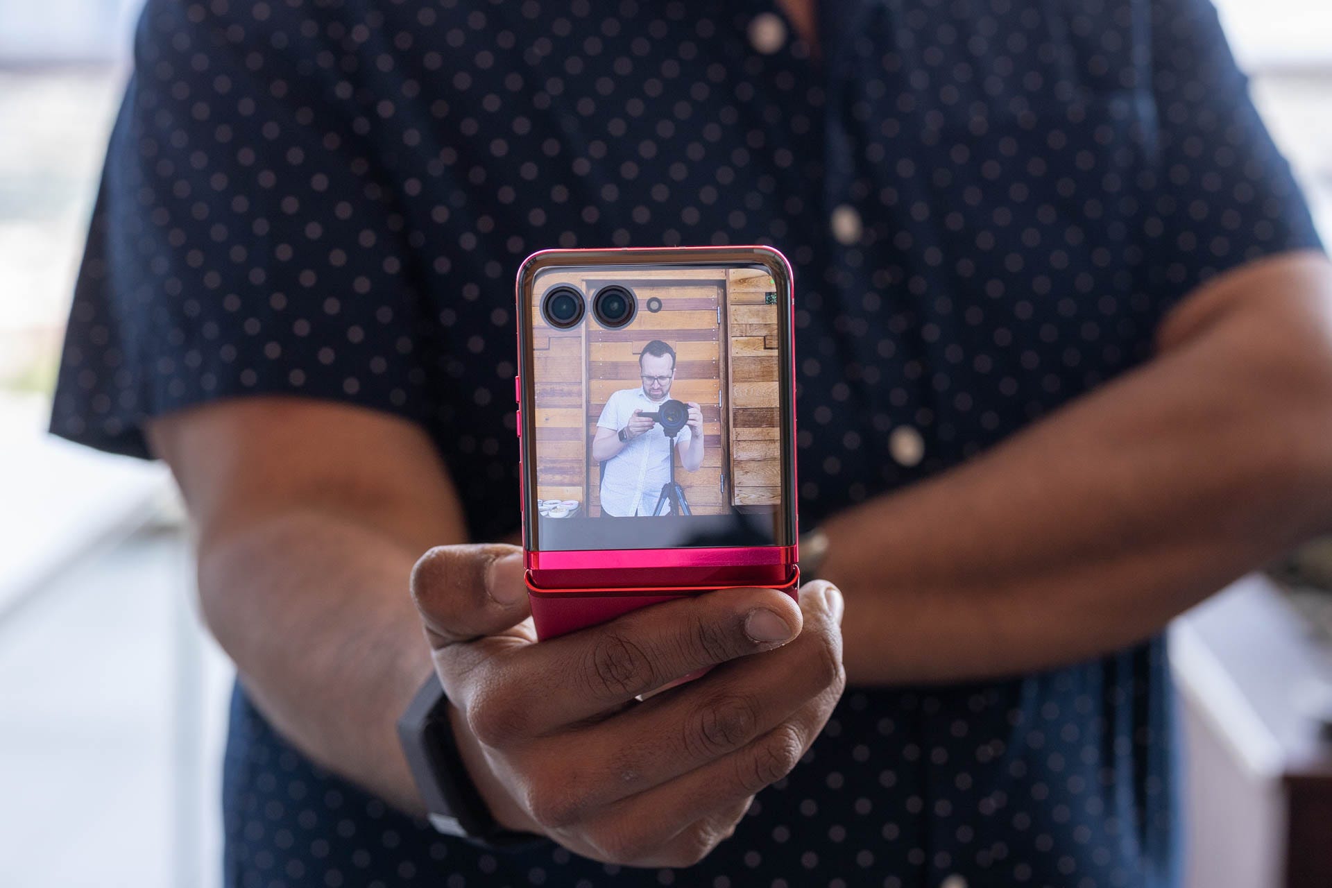
The cameras themselves are fine from my initial testing but they likely won't win any awards. They'll be great for most people and Motorola has added a feature where you can see the shot on the front screen as you're taking it. This means you're less likely to have to take additional photos of a subject as they can see the photo as you're taking it.
When can you buy the Motorola RAZR and RAZR+?
The RAZR+ goes up for pre-order in the US on June 16 directly with Motorola and will cost $999.99 before any offers. The RAZR is expected to be meaningfully cheaper when it goes on sale later this year.
The Viva Magenta RAZR+ is exclusive to T-Mobile in the US (and is also available from Motorola directly), whereas the other colors will be available from a range of retailers and carriers including AT&T, Spectrum Mobile, Google Fi, Optimum Mobile, Amazon, and Best Buy.
Outside the US, the RAZR will be sold as the RAZR 40 whilst the RAZR+ will go by the RAZR 40 Ultra. The RAZR 40 Ultra will start at €1,199.99 and is available to pre-order today.
Should you buy the Motorola RAZR or RAZR+?
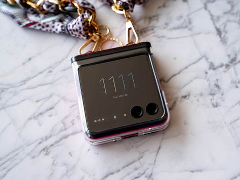
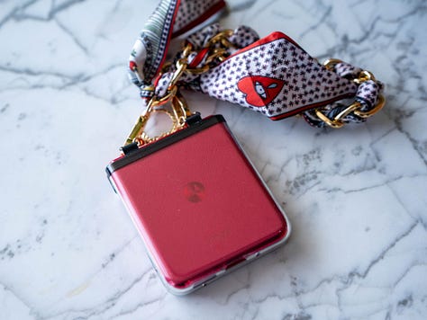
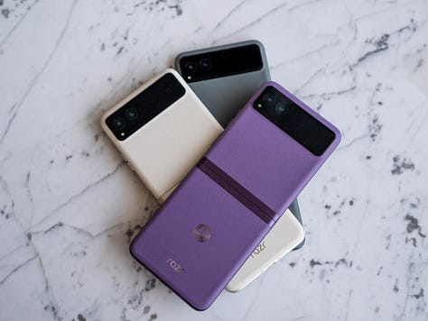
If you want a flip phone, look no further: the RAZR+ is my new favorite foldable phone. Motorola has made all the right changes and improvements from previous generations, and the result is an absolutely incredible phone. I’ll reserve my final judgment for my upcoming review, but I’m very excited for the RAZR+ and it’s quite likely going to be the phone that I keep in my pocket at all times.


