Sorry Google, but the Pixel Fold design is a bust
The Pixel Fold has some things that are really appealing but its design has left me wanting a lot more
I love foldable phones and have a ton of them in my collection, but the one I’ve been most excited about in a long time is the Pixel Fold. Yet, within just minutes of my Google Pixel Fold unboxing, I felt underwhelmed by the overall experience.
Most of this comes down to the hardware design, and while I’m still finalizing our full Pixel Fold review, the design is something I won’t change my opinion about. The result is a phone with some promise but interesting design choices that Google should have done better with.
How does the Pixel Fold compare to others?
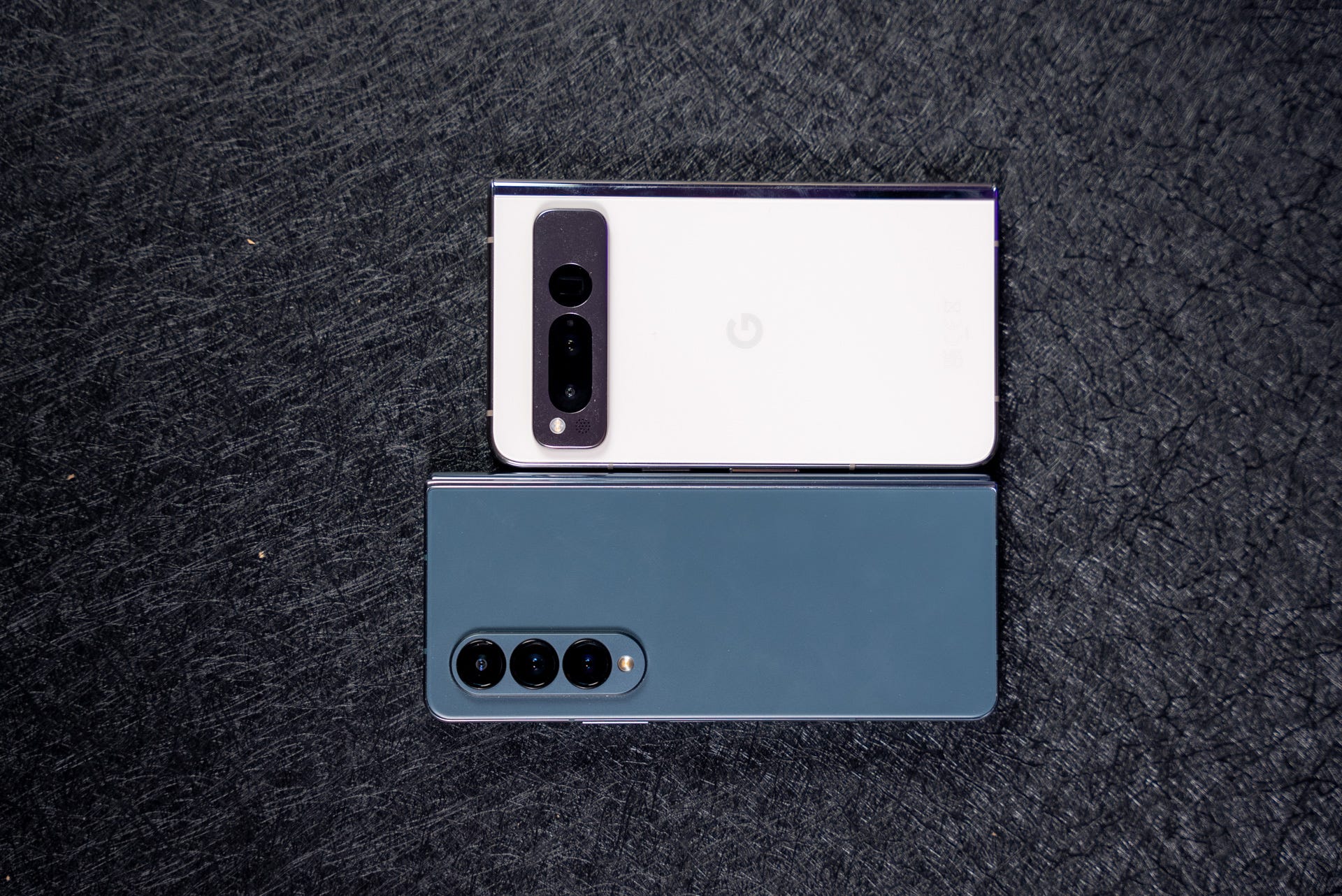
Here’s how the size shapes up against the Samsung Galaxy Z Fold 4 and the Oppo Find N2, the latter being the best design I enjoy the most.
What the Pixel Fold design gets right
Design is usually not that subjective, but foldable phones come in many form factors. Whereas every traditional smartphone design ultimately comes down to being a candy bar slab with some colors – or cool light tricks like the Nothing Phone – foldable phones are the new frontier of design.
There’s the Motorola Razr+, the Oppo Find N2 Flip, and the Galaxy Z Flip 4, all of which are flip phones but take different approaches to the front display. For book-style foldables, there’s the Galaxy Z Fold 4, Oppo Find N2, and the Vivo X Fold 2, which all have a big inner screen and an outer screen of varying sizes.
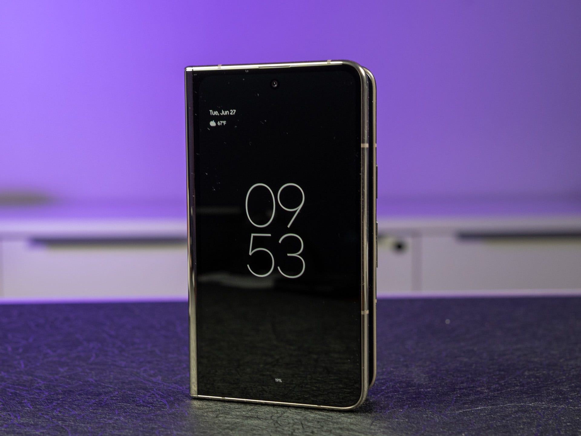
Then there’s the Google Pixel Fold. For many people, the Galaxy Z Fold 4’s outer display is a little too narrow, and the inner display is too tall. The Galaxy Z Fold 4 uses a 23.1:9 aspect ratio on the front, which is abnormal compared to most phones' regular 16:9 aspect ratio. In comparison, the Pixel Fold is wider and shorter, which means it’s more of a traditional smartphone experience and is more akin to the Oppo Find N2 design than the Galaxy Z Fold 4.
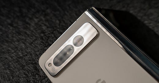
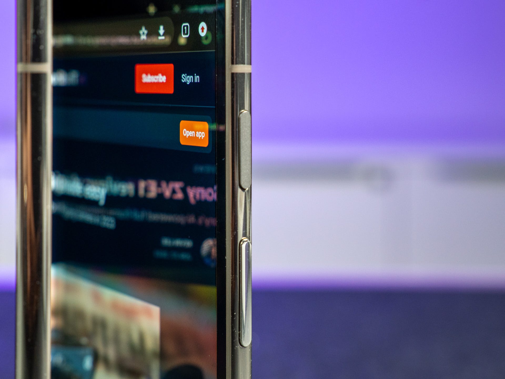
The back of the Pixel Fold is quite nice; it’s built from Gorilla Glass Victus, and my Porcelain (aka white) color doesn’t show fingerprints, unlike many other phones. In between is the teardrop hinge, an area that heavily detracts from the premium feeling of the phone. The Pixel Fold should tick every box for most people, yet when you start to use the phone, you realize where it falls short.
Unfolded is where the Pixel Fold shines; it’s fantastic and feels like a very comfortable and impossibly thin tablet. If this were just a tablet, this would be great, but I use a foldable phone more folded than unfolded, and this is where the Pixel Fold struggles.
Where the Pixel Fold design fails
As I mentioned, the Pixel Fold is fantastic when it’s unfolded. It feels super premium in the hand, the weight is fairly evenly distributed, and it feels like a premium device. Yet. when you fold it, it falls short for a few key reasons: the width, the weight, and, crucially, how that weight is distributed in the hand.
At 283 grams, the Pixel Fold is one of the heaviest foldable phones launched so far. This wouldn’t be a problem – and it isn’t a problem when it’s unfolded – but a large amount of the weight is concentrated around the camera. As a result, it’s incredibly top-heavy, and although this wouldn’t be a problem on its own, the width compounds this further.
You’ll need to use the Pixel Fold with two hands at all times
The dimensions of the Pixel Fold make it one of the widest foldables when folded, and this is where I truly struggle with it. At 79.5mm wide, it’s about 10mm wide for easy one-handed usage, and I’ve resorted to using it with two hands, even when folded. It somewhat defeats the front display's purpose – the Pixel Fold is effectively a device you’ll always need to hold with two hands.
The last area of the design that drives me crazy is the hinge; simply put, it’s a complete fingerprint magnet that you will obsess over keeping clean. Except, you won’t be able to: during my unboxing, it collected a lot of fingerprints that came off with a few wipes using a microfiber cloth, only for them to collect again almost immediately. Most cases won’t cover the hinge either, and while it is hidden, it’s a frustration that shouldn’t occur with a phone that costs $1,800.
What about the rest of the Pixel Fold?
The rest of my Pixel Fold experience has been a mix of emotions. As I mentioned in our Pixel Fold camera review, the camera is an absolute joy. Google’s Pixel camera science has proven incredibly competitive – even when using hardware that shouldn’t compete with the 200MP camera found on the Galaxy S23 Ultra – and now, the Pixel Fold brings a 5x telephoto zoom that I also love using.
The battery life has also been good enough, lasting a day in most cases, although it takes a long time to charge to full, even with 30W wired fast charging. Google’s Tensor processor is the part that I struggle the most with – it can be slow to respond, overheats quite often, and doesn’t deliver the premium experience you’d expect from a $1,800 phone.
Google has naturally made some tweaks and improvements to the overall user experience and features in Android that are designed for large screens and the foldable form factor. Yet, Samsung’s multitasking is considerably better, although granted, the Korean company has had ten years of experience building multitasking into its phones. I expected Google to offer more Pixel Fold-specific features that would take advantage of the larger display and form factor.
For more on the Pixel Fold, stay tuned for our full review, and don’t forget to check out our Google Pixel Fold camera review.

